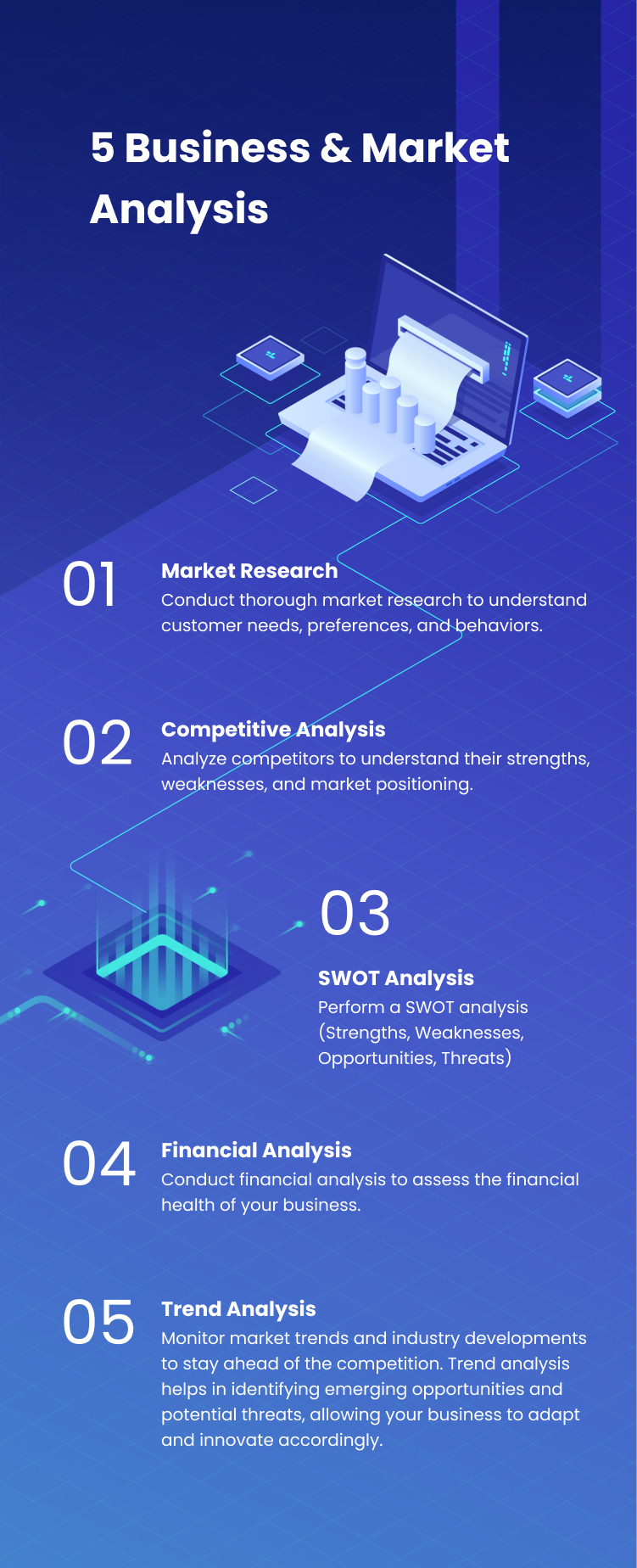
Finance Investment Visualization
"5 Key Aspects of Finance & Investment Visualization: From Data to Decisions"
-
Dynamic Data Representation
Modern tools like FineVis enable animated visualizations (e.g., dynamic折线图) to showcase real-time market trends and portfolio performance, enhancing user engagement. Interactive features such as data drilling and linked charts allow investors to explore granular details while maintaining a holistic view. -
Multi-Dimensional Analysis
Visualization integrates diverse metrics (e.g., risk-reward scatter plots, asset allocation pie charts) to reveal hidden patterns in complex datasets. Tools like Mplfinance support叠加技术指标 (e.g., moving averages, RSI) for comprehensive stock analysis. -
User-Centric Design
Dashboards prioritize intuitive layouts with color-coded charts and minimal clutter, catering to both novice investors and professionals. Customizable interfaces (e.g., personalized risk tolerance displays) align with individual investment goals. -
Real-Time & Predictive Insights
AI-driven tools (e.g., Tableau, Power BI) automate trend detection and forecast market movements using historical and real-time data. Platforms like Morningstar Portfolio Manager offer tax-loss harvesting suggestions based on visualized projections. -
Security & Compliance
Encryption and anonymization techniques protect sensitive financial data during visualization, adhering to regulatory standards. Portfolio visualizers like Kubera allow privacy controls for shared data, balancing transparency and confidentiality.