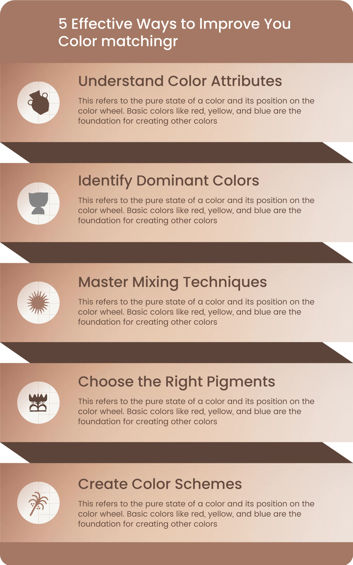
5 Effective Ways to lmprove You Color matching Infographic Template
"5 Effective Ways to Improve Your Color Matching: Expert Techniques for Perfect Harmony"
-
Master Color Theory
Understand primary, secondary, and tertiary colors through the color wheel to create balanced palettes. Apply concepts like complementary (high contrast) or analogous (harmonious) schemes for cohesive designs. -
Use Digital Tools
Leverage platforms like Adobe Color or Coolors to generate and test palettes efficiently. Digital color meters (e.g., spectrophotometers) ensure accuracy across materials and screens. -
Test in Context
Evaluate colors in actual lighting conditions—paint large swatches or use virtual apps to avoid mismatches. For designs, mock up layouts with fabric/furniture samples to assess real-world harmony. -
Follow Structured Rules
Apply the 60-30-10 rule (dominant-secondary-accent ratios) for visual balance. Limit palettes to 3-4 main colors to prevent chaos, using accents sparingly. -
Analyze Psychological Impact
Choose hues aligned with emotional goals (e.g., blue for trust, yellow for energy). Consider cultural associations to ensure global relevance.
For advanced techniques like gradients or high-contrast pairings, explore tools like LUTs or spectral analysis.