B2B vs B2C Comparison Infographic Template
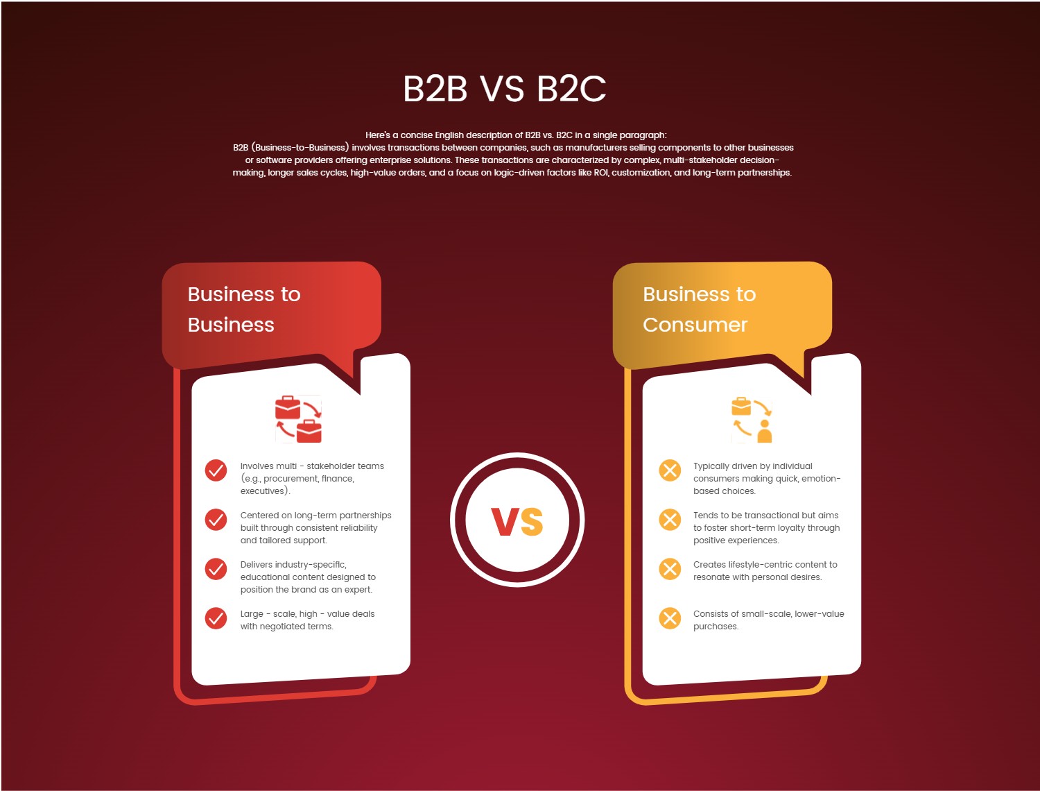
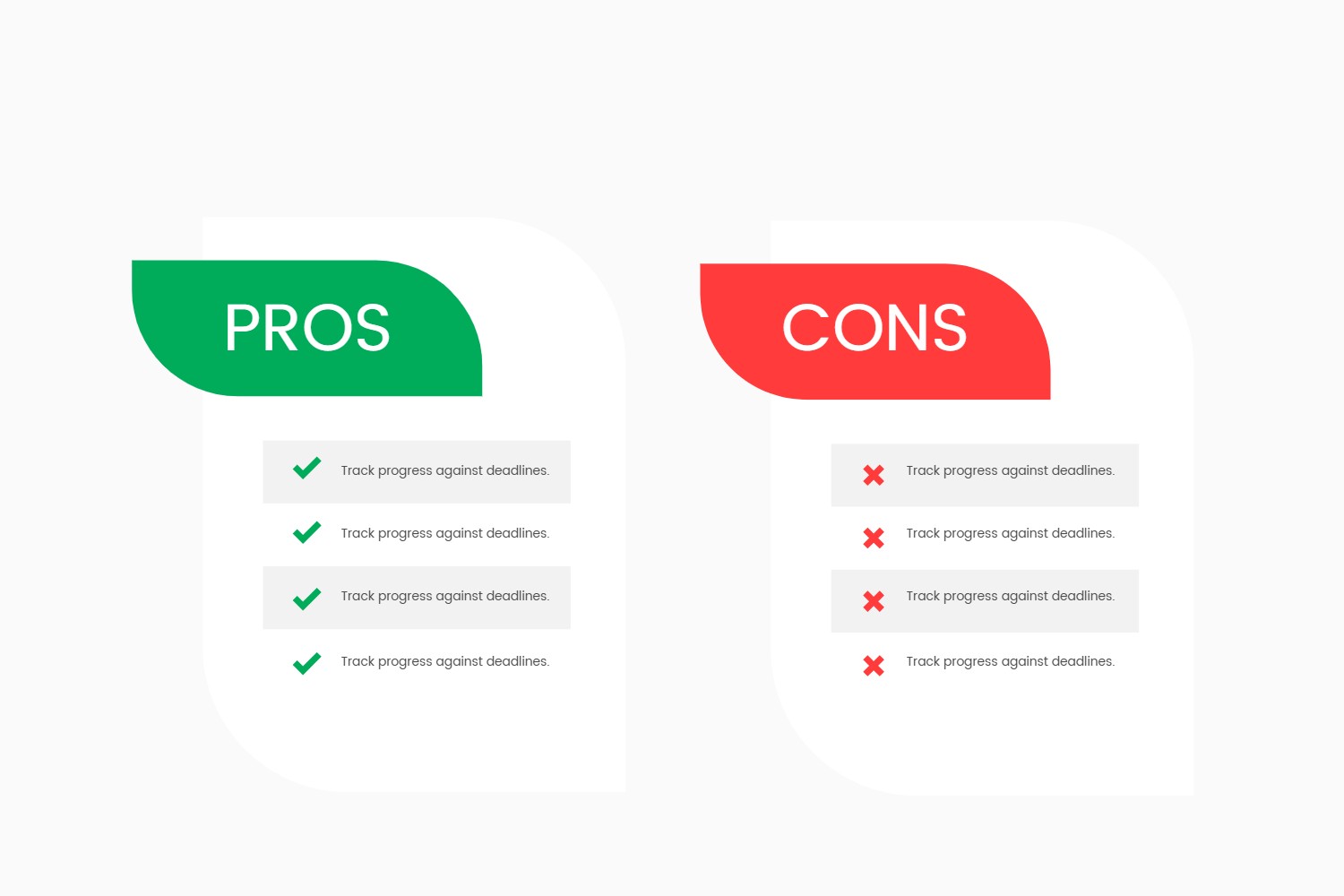
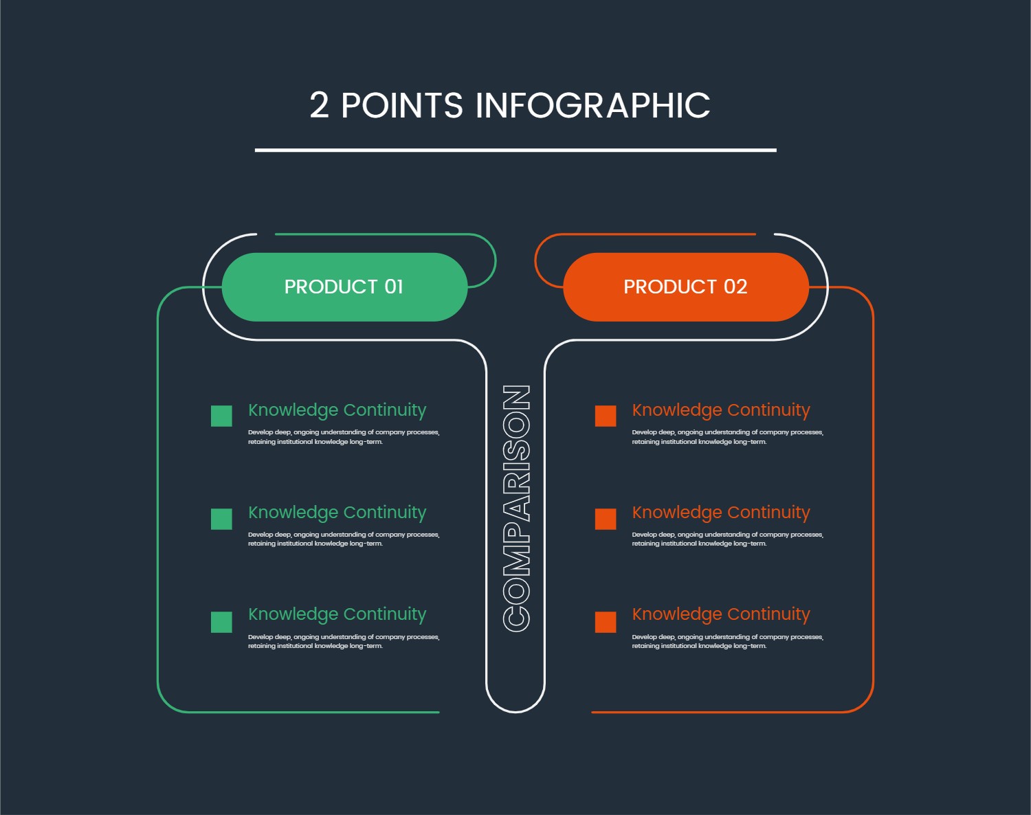
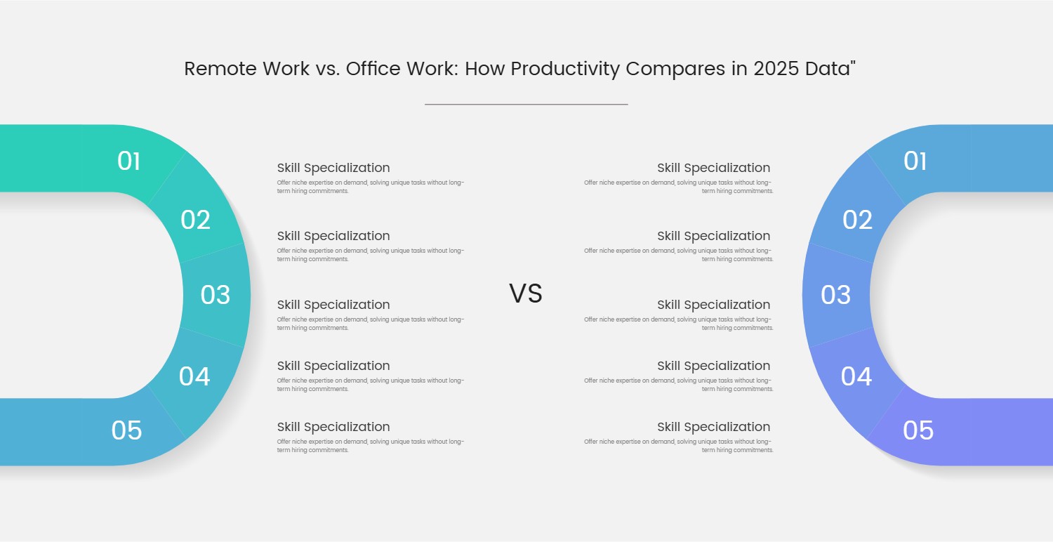
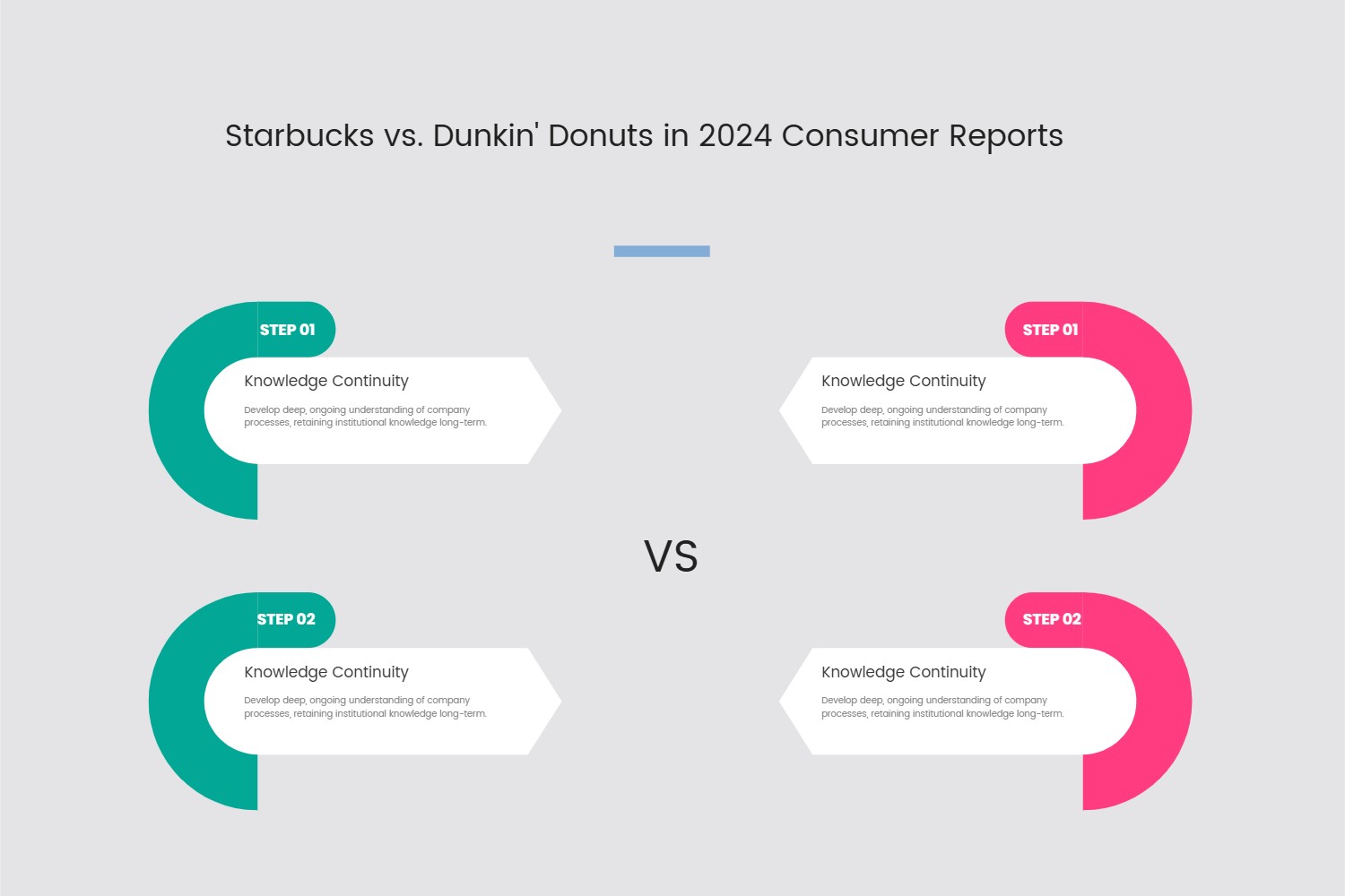
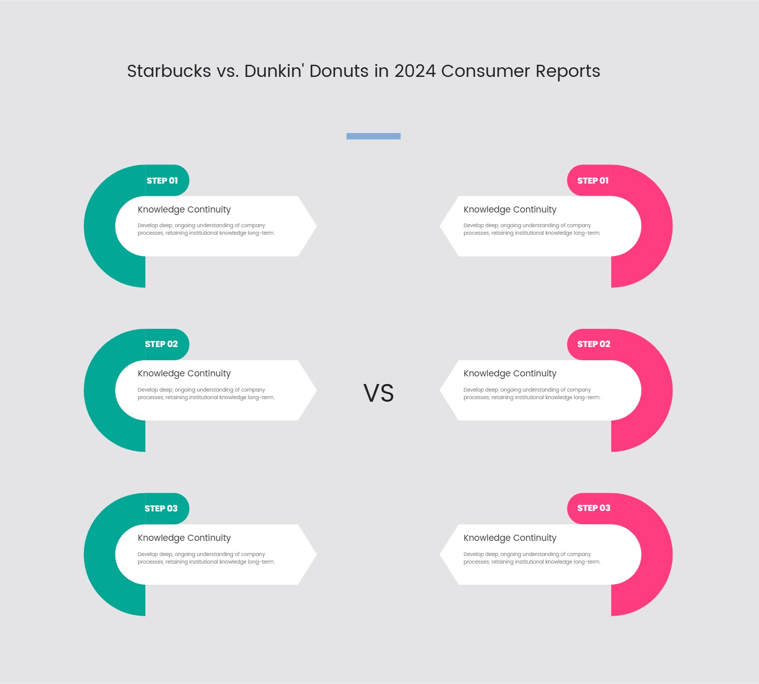
This template offers a highly effective and visually engaging framework for presenting comparative information. Designed with clarity and impact in mind, its aesthetic features a sophisticated dark background that allows vibrant, contrasting color blocks – typically red and a warm gold – to highlight distinct categories. Each category is introduced by a prominent, speech bubble-style header, drawing immediate attention to the topic at hand.
Below these headers, content is organized into easily digestible bullet points, often accompanied by simple, intuitive icons that visually reinforce the key takeaways. This structure ensures that even complex comparisons are communicated with maximum efficiency and minimal clutter. A bold, central "VS" graphic serves as the primary focal point, unequivocally signaling the template's purpose and guiding the viewer's eye across the contrasting elements. The overall layout is clean, professional, and conducive to quick comprehension.
This versatile design is perfectly suited for a wide array of use cases requiring a clear side-by-side analysis. Businesses can leverage it for internal training modules, differentiating between two operational strategies or departmental functions. Marketing teams will find it invaluable for illustrating the distinctions between product versions, service tiers, or even competitive offerings in a compelling presentation. Educators can employ it to break down complex academic concepts into comparative analyses, aiding student understanding. Furthermore, it's an excellent choice for corporate reports, pitch decks, or any digital content where highlighting differences and similarities is paramount for informed decision-making or effective communication.
#TemplateDesign #VisualComparison #PresentationTemplate #InfographicDesign #BusinessTools #EducationalDesign #MarketingMaterial #DataVisualization #ComparativeAnalysis