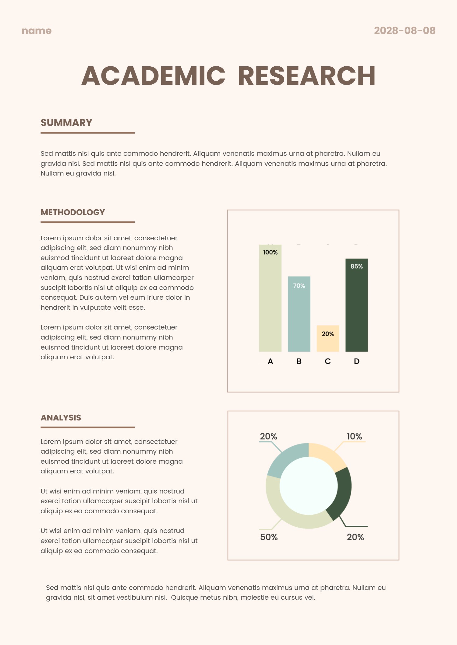
Remote vs. Office Work Productivity Comparison Slide Template
Other
Size, Color, Industry, Style
Size
Landscape
Style
Modern
Color
Black, Gray
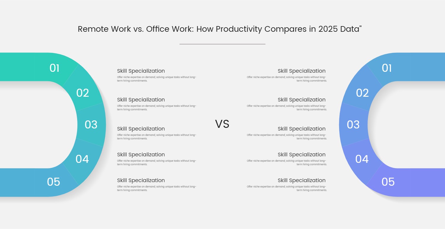
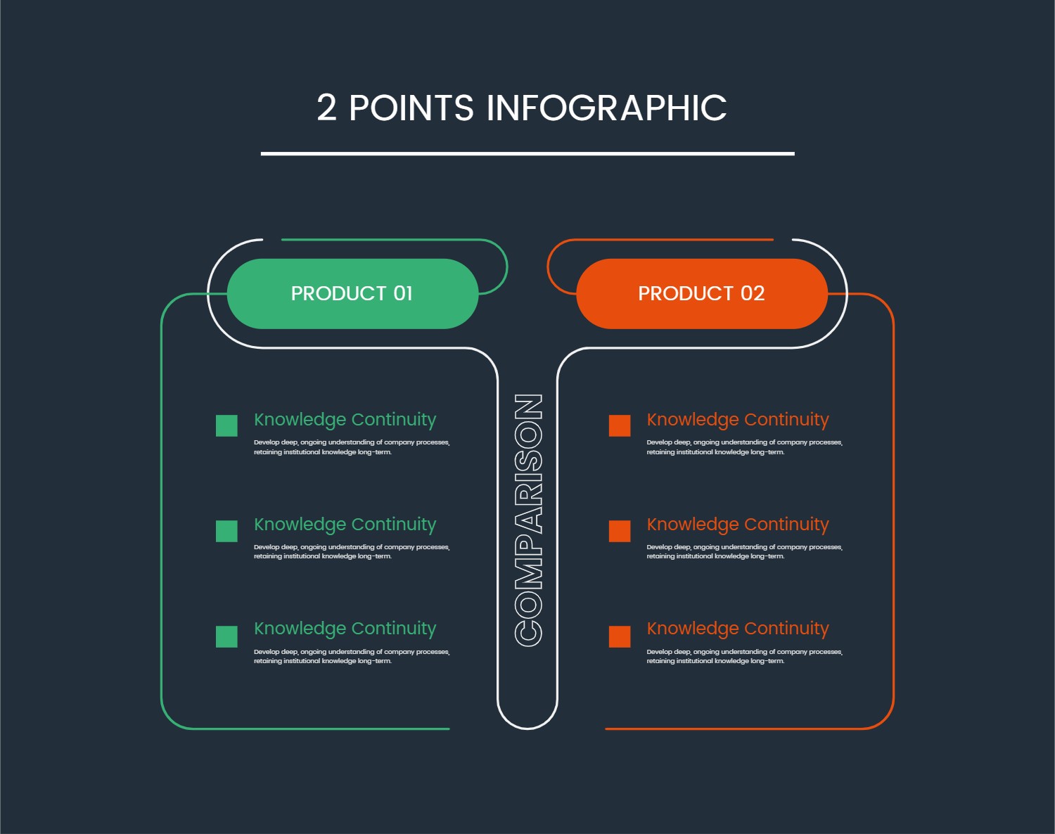
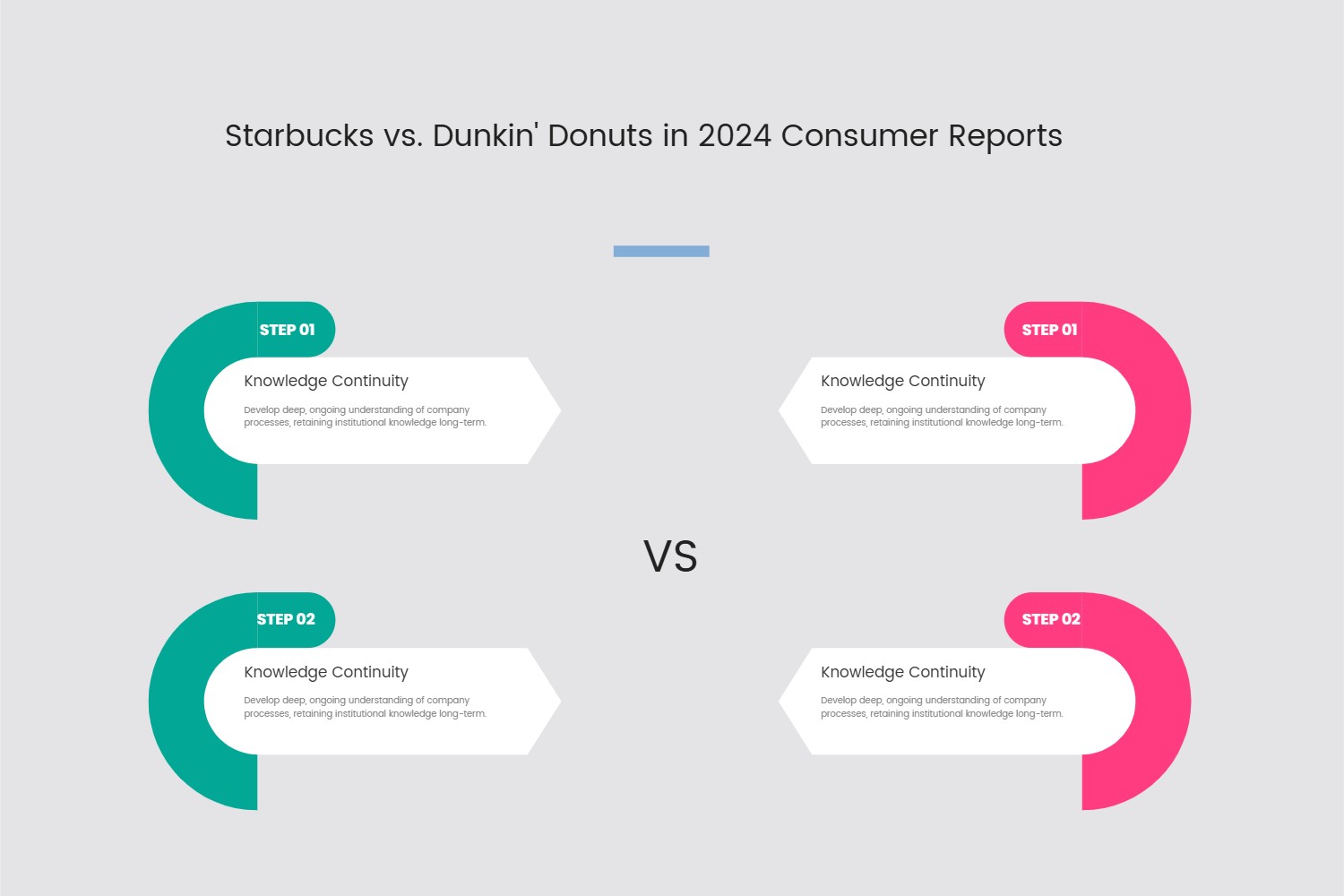
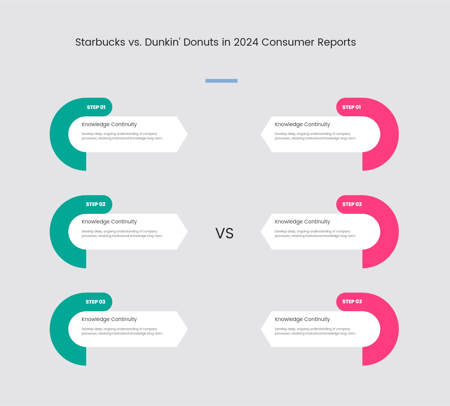
This template presents a highly effective and visually engaging layout designed for comparative analysis. Its core structure revolves around a prominent "VS" indicator, flanked by two distinct, multi-segment infographic elements. Each side features a large, C-shaped or U-shaped visual divided into five numbered sections, ranging from 01 to 05. These segments are rendered with contrasting color gradients—a vibrant green-to-blue on the left and a calming blue-to-purple on the right—effectively differentiating the two subjects being compared.
Adjacent to each numbered segment, a dedicated text box provides ample space for descriptive content. This arrangement allows for a detailed, point-by-point comparison, making complex information easily digestible. The overall aesthetic is clean and modern, with a minimalist background that ensures the focus remains on the presented data.
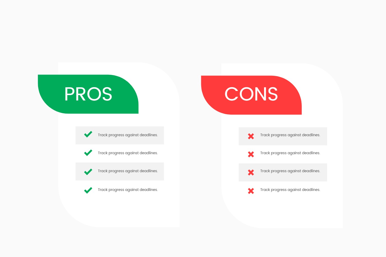
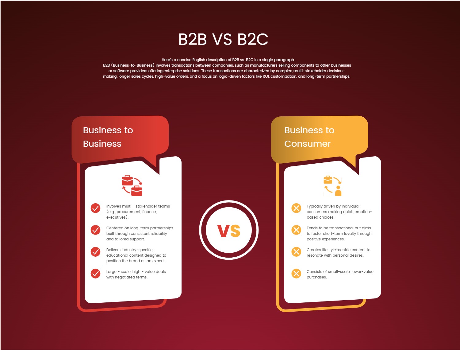
This design is ideally suited for presentations requiring a clear, structured comparison of two entities, concepts, or datasets. Use cases include evaluating business strategies, contrasting product features, outlining the pros and cons of different approaches, or presenting research findings side-by-side. It's perfect for educational settings, business reviews, marketing pitches, or any scenario where a direct, visually supported comparison is crucial for audience comprehension and decision-making.
#TemplateDesign #PresentationLayout #ComparativeAnalysis #Infographic #DataVisualization
