Group Comparison Infographic Template for Business Analysis Infographic Template
A Versatile Comparison Template
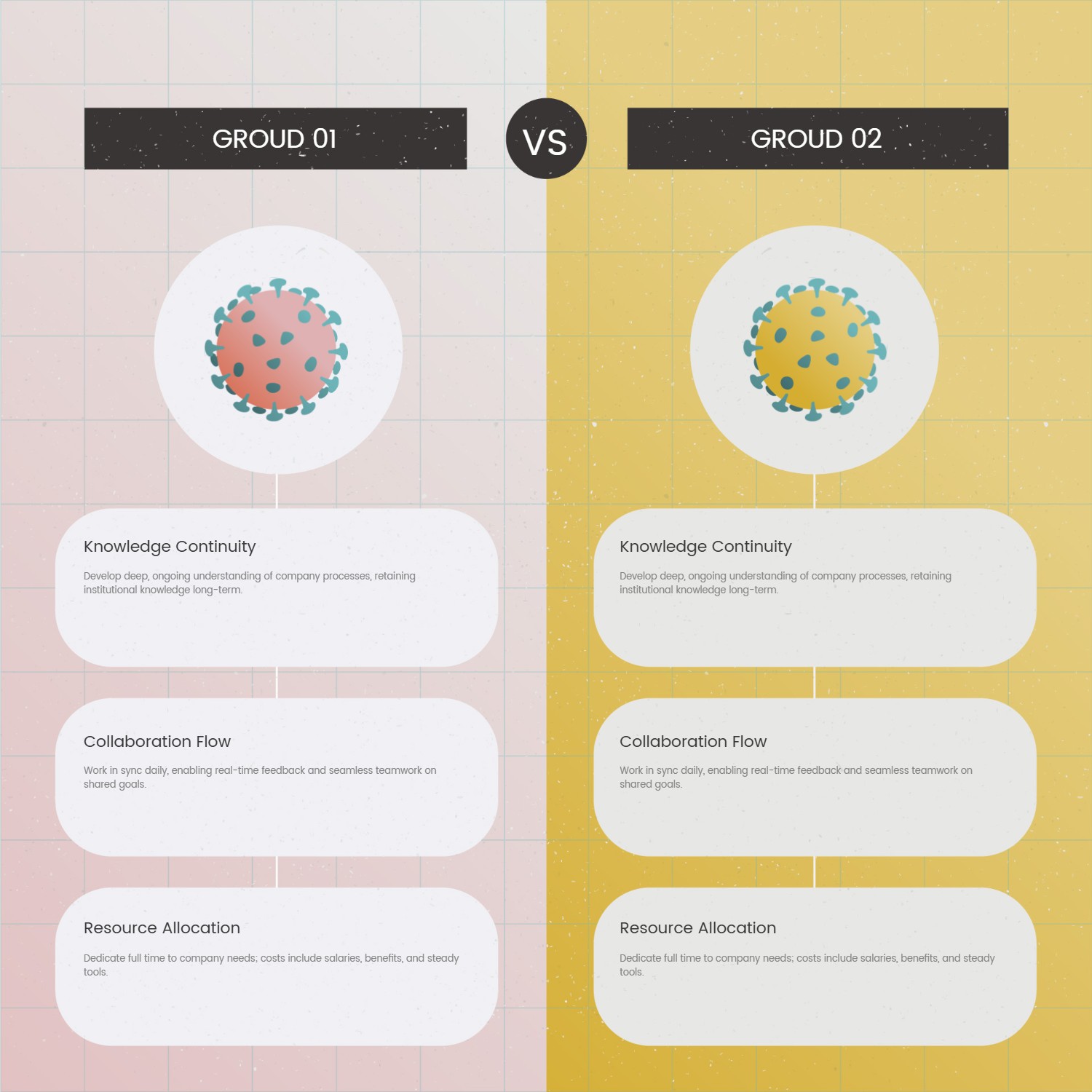
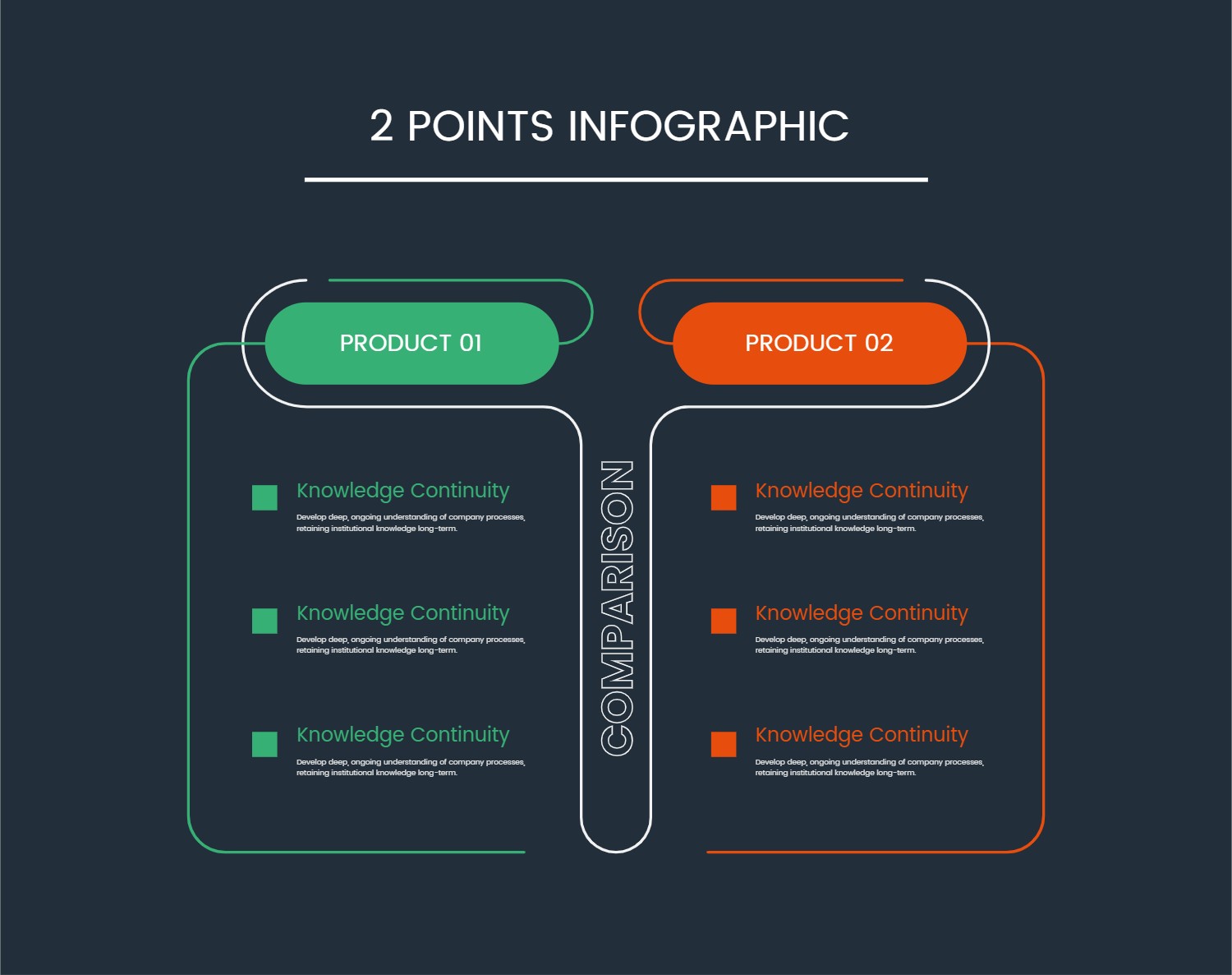
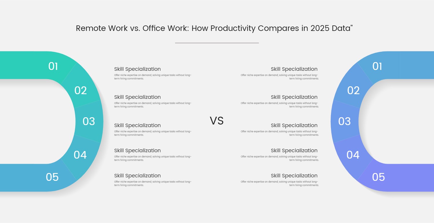
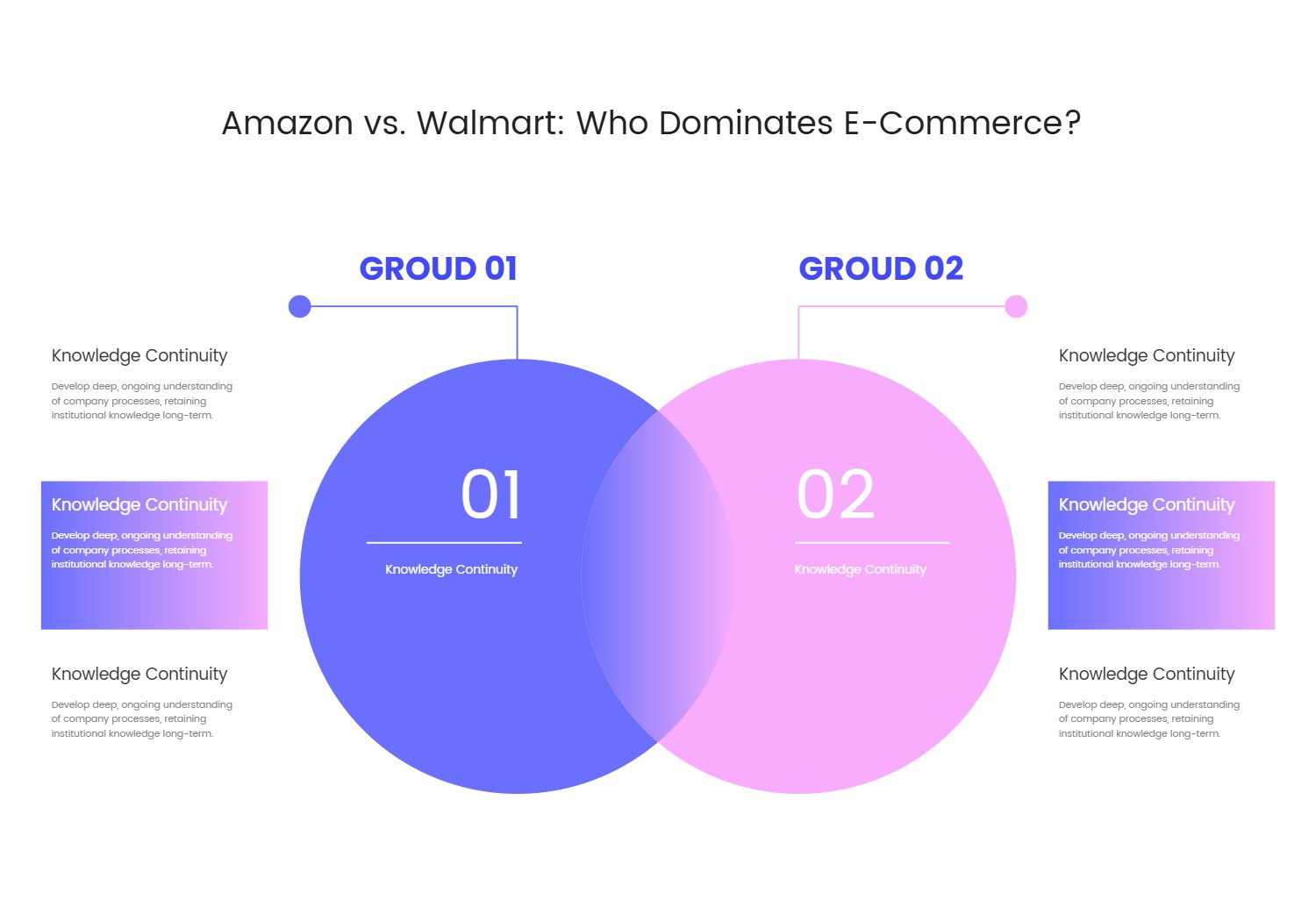
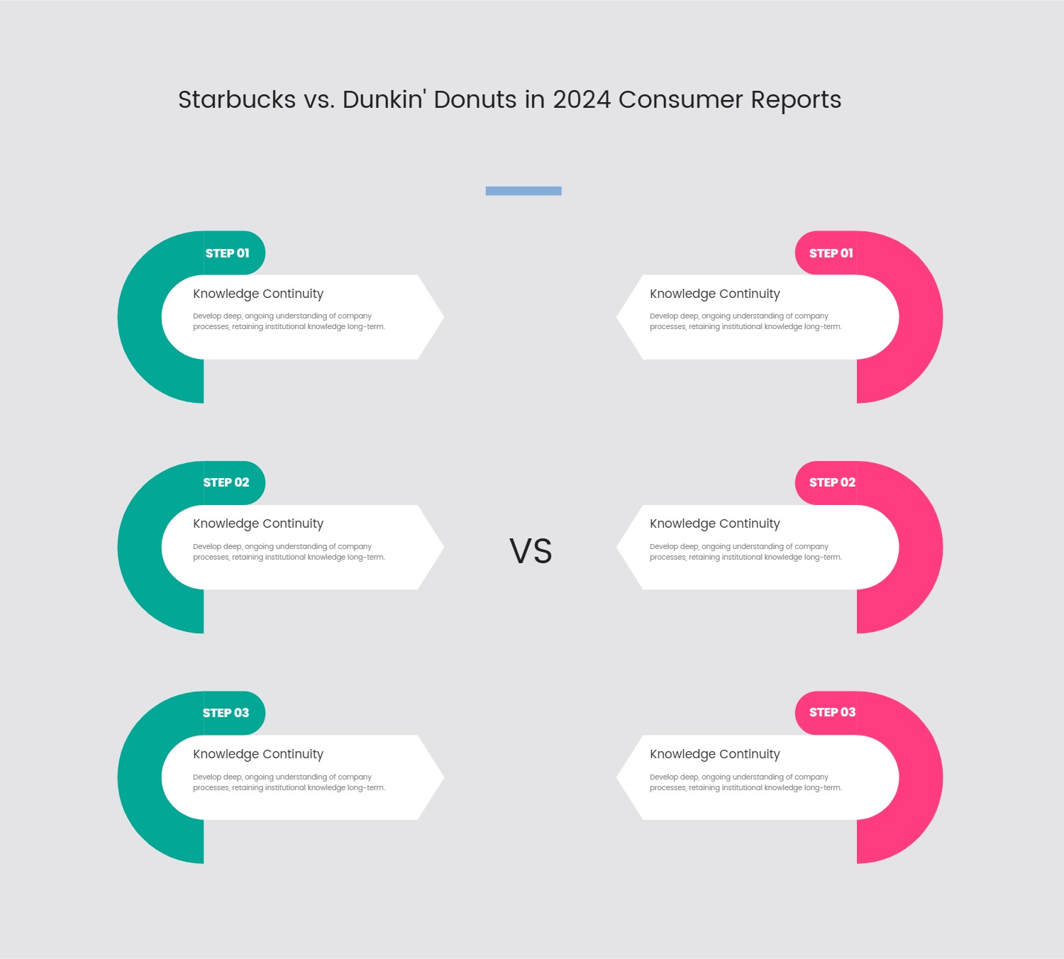
This template presents a highly effective and visually clear framework designed for direct, side-by-side comparisons. The layout is thoughtfully segmented into two distinct panels, labeled "Group 01" and "Group 02," with a prominent "VS" indicator centrally placed to emphasize the comparative nature. Each group is introduced by a unique circular visual element, followed by three dedicated content blocks. These blocks are consistently sized and positioned, providing a structured space for detailed descriptions or key characteristics.
The design employs a clean aesthetic with a subtle, textured grid background that adds depth without detracting from the primary content. The use of distinct background colors for each panel subtly differentiates the two comparative entities. This template's structured approach ensures that information is presented logically and coherently, making complex comparisons easily digestible for the audience.
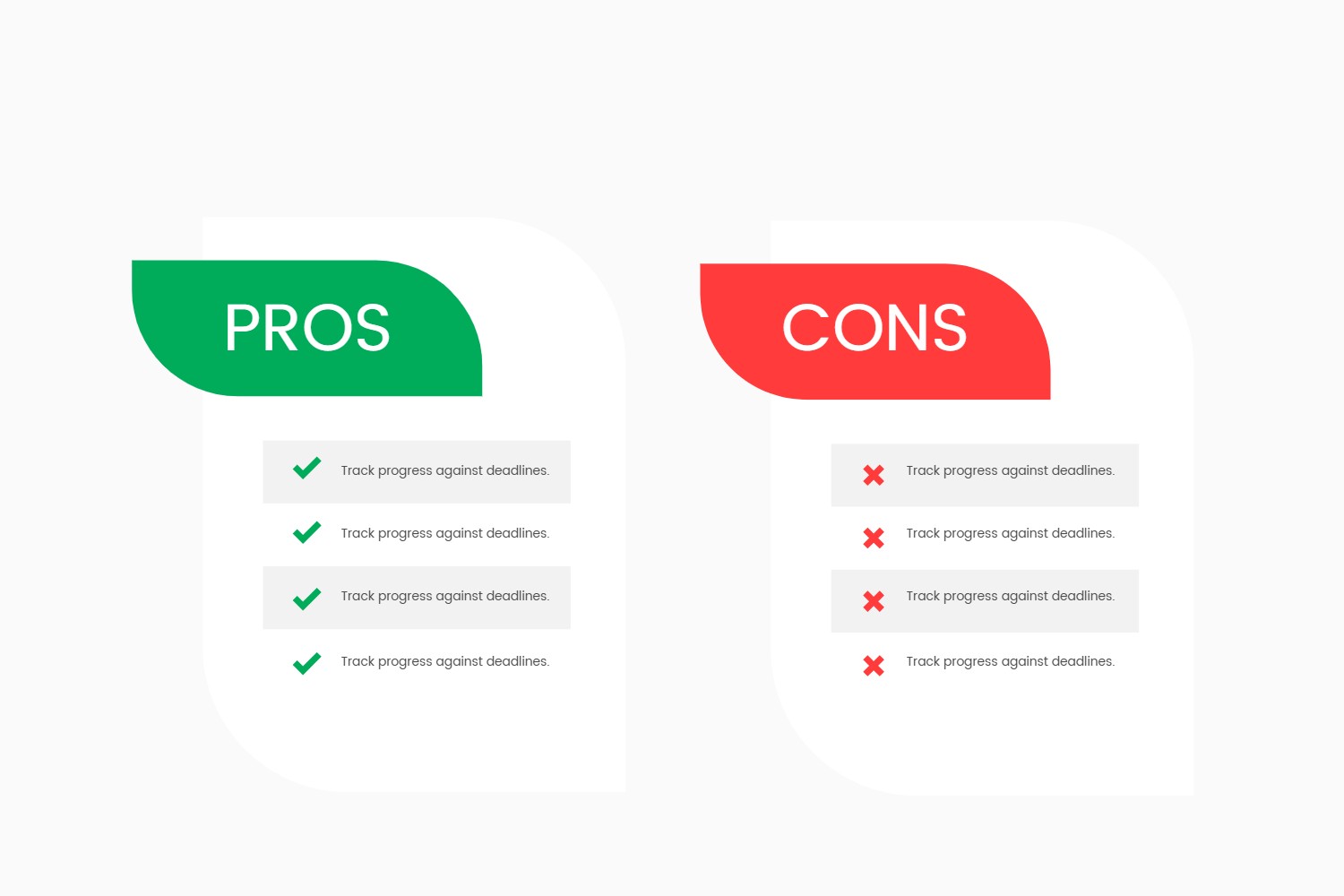
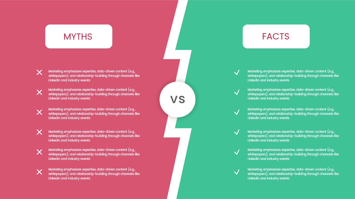
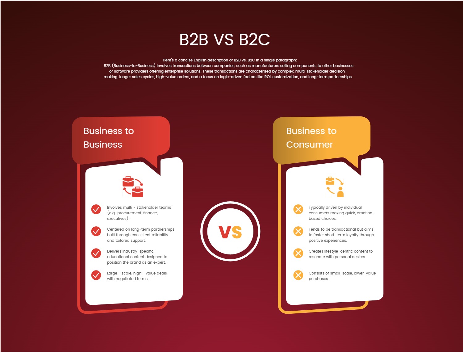
Its primary use case lies in any scenario where two distinct entities, concepts, strategies, or groups need to be evaluated against a common set of criteria. Businesses can leverage this for comparing product features, market segments, operational models, or team structures. It's also suitable for educational contexts to contrast theories or historical events, or for internal presentations to weigh the pros and cons of different approaches. The template streamlines the process of presenting dual analyses, facilitating clear communication and informed decision-making by highlighting differences and similarities in an organized manner.
#TemplateDesign #ComparisonTool #PresentationLayout #VisualCommunication #Infographic
