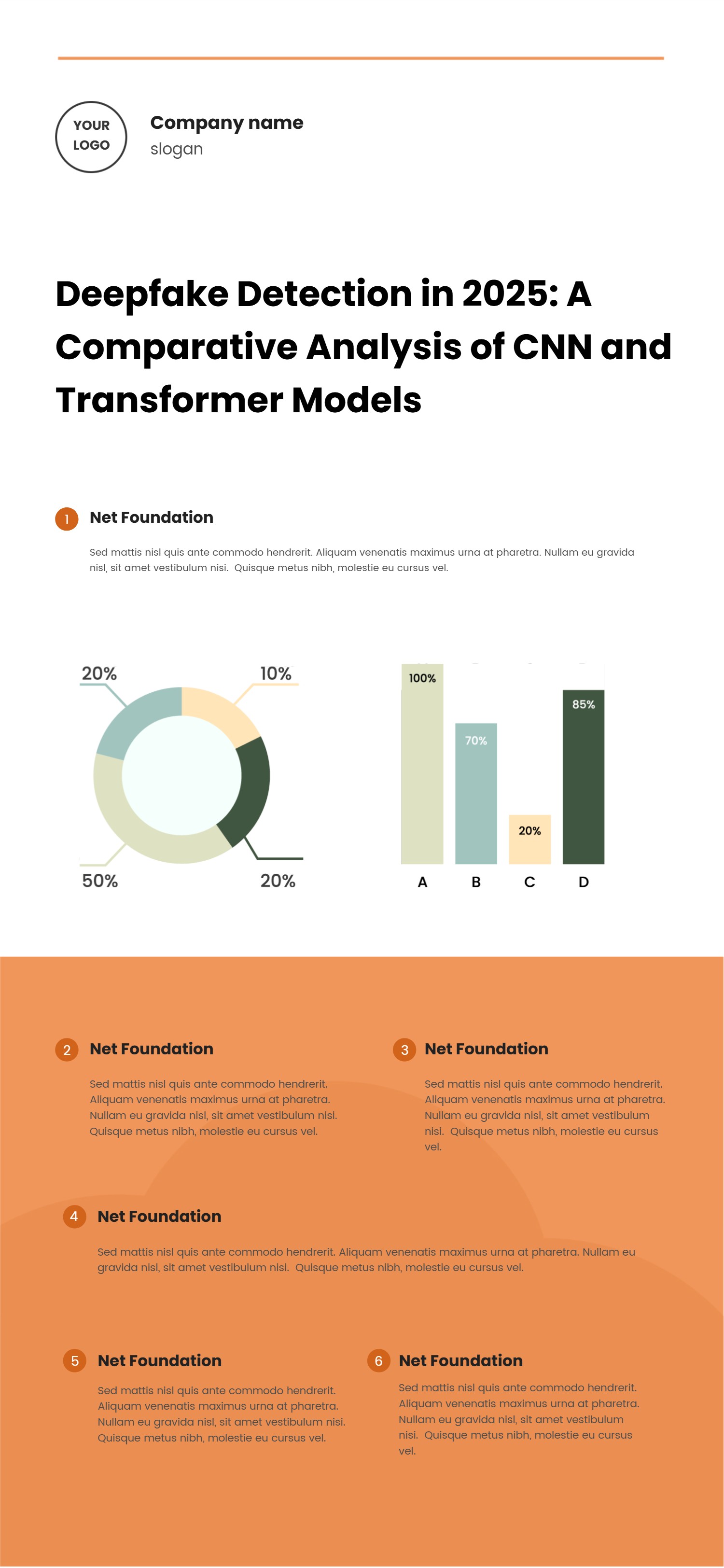
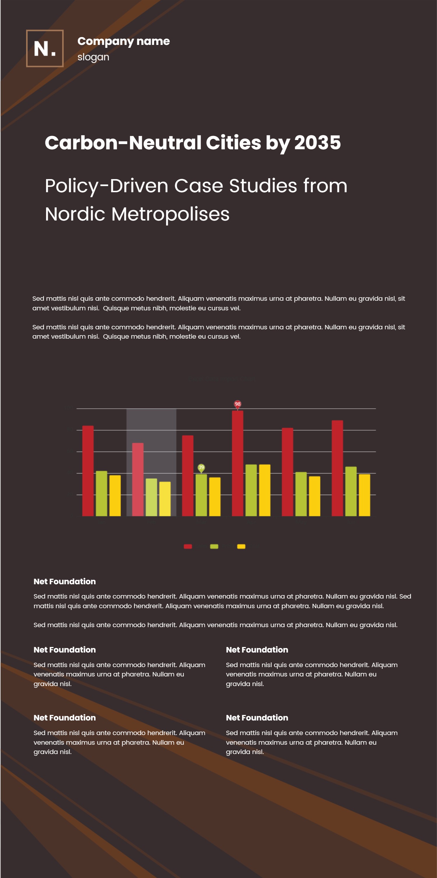
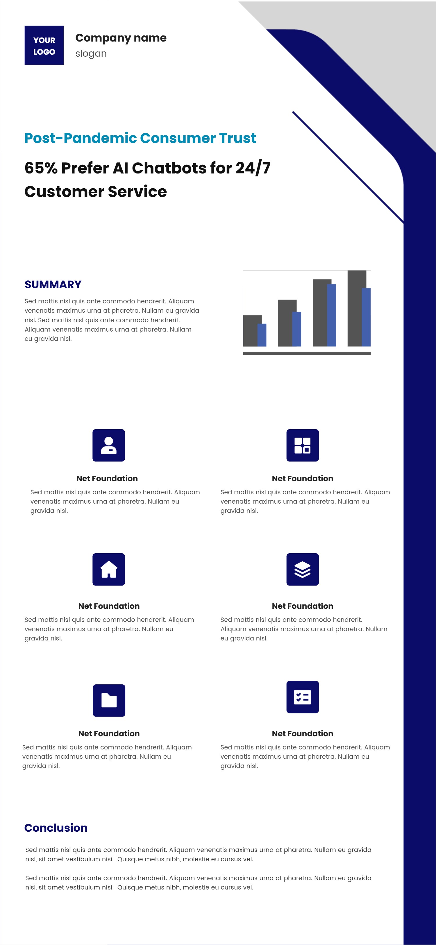
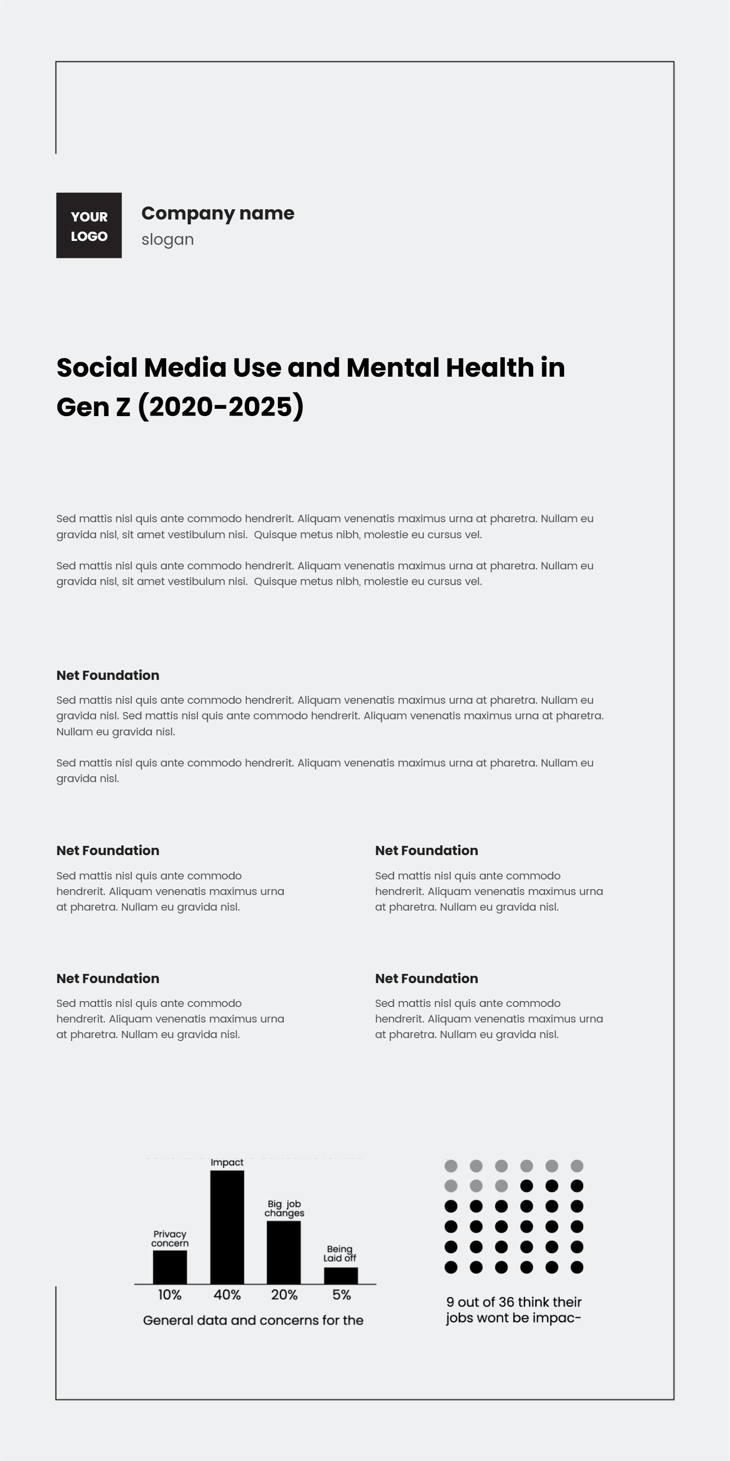
Waffle Chart Design Template
What is Waffle Chart Design Infographic: This infographic explains how a waffle chart turns percentages into a clean 10 by 10 grid. It shows filled squares, legends, and short labels so readers can see proportions at a glance without heavy math. The template also shows how waffle chart blocks can sit next to bar or pie charts in the same design system, keeping colors and type consistent. Language stays plain so teams can reuse it across reports, dashboards, and social posts.
When to Use Waffle Chart Template Infographic: Use it when you want to show budget splits, survey responses, milestone progress, or feature adoption without long tables. It works in status decks, product updates, marketing recaps, and nonprofit impact briefs. Because the waffle chart grid is easy to read, it helps audiences compare categories or see how close a goal is in a few seconds.
How to apply the template in the AI generator: Open the AI tool, choose the data-rich layout, and paste prompts like waffle chart 65 percent filled with legend and comparison bars. The generator fills the grid, labels, and legend colors. You can add notes for targets, attach small icons, and include short descriptions for each category. The steps are quick: pick template, enter prompt, review placement, and save.
Download and edit options: Click download to open the editor. Save as PPT for decks, PNG for blogs, or SVG for posters. You can adjust grid size, change colors, add target outlines, or pair the waffle chart with a line chart for trend context. After edits, export again while keeping spacing and legends intact.
FAQ Q: Can I show multiple categories in one waffle chart? A: Yes, split the grid into color blocks and add a clear legend with short labels. Q: How do I label exact numbers? A: Add a small number next to the grid or under the title while keeping the legend simple. Q: Can I animate filling? A: Export the PPT version and add slide animations so squares fill as you present progress. Q: Will small percentages be visible? A: Even a few filled squares stand out; keep colors distinct and the legend tight. Q: Can I add a target line? A: Outline the target percentage with a thin box so viewers see how far the fill is from the goal.