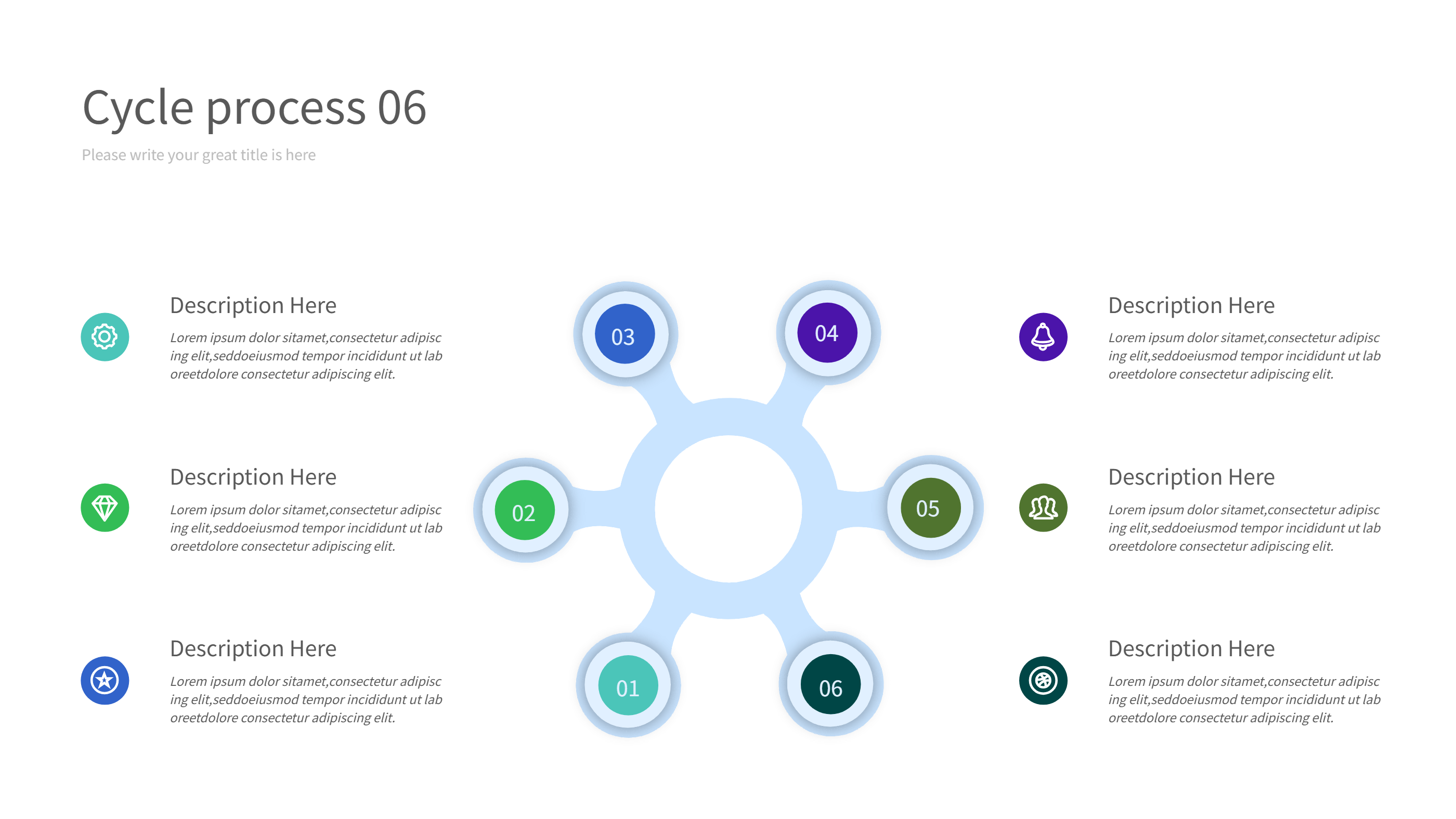
Fuel Savings Atkinson vs Otto Cycle Infographic
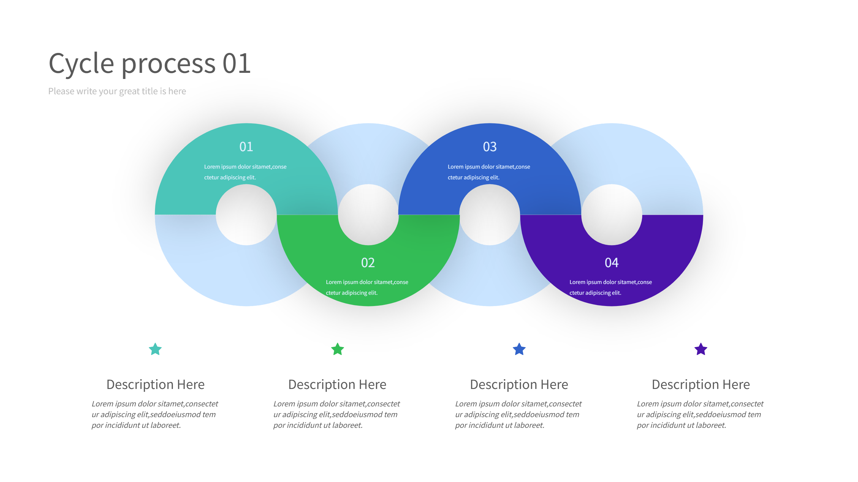
This infographic explains fuel savings and emission reduction when comparing the Atkinson cycle and the Otto cycle. The four-step cycle layout shows each stage with a short note so readers can see the flow without deep engineering terms. Soft gradients and numbered steps guide the eye in a calm way.
Use one block for intake, one for compression, one for power, and one for exhaust. In each block, add a simple fuel use line and a simple emissions note. Mention how valve timing in the Atkinson cycle can lower pumping loss, and how that affects fuel economy. Keep sentences short to make the comparison easy for mixed audiences.
Add a small summary near the center with the main takeaway: where efficiency improves, how torque feels, and what that means for city driving. Include a note about hybrid vehicles that often use the Atkinson cycle. This fuel savings Atkinson vs Otto cycle infographic works for training, reports, and blog posts.
To generate it fast, open the AI generation tool on the home page, choose this cycle infographic template, enter a prompt with your four stages, fuel numbers, and emission notes, and the tool will build the graphic for you.
Share the visual in presentations or printed sheets. Keep icons simple, such as fuel drops, arrows, and leaf symbols. Update numbers when you have new test data. The clear layout keeps the technical topic approachable. Mention how smoother torque delivery can help city drivers and hybrids. Add a line about how regular maintenance and tire care also improve fuel savings beyond the cycle choice.