Shadcn Chart and React Native Chart Kit Dashboard Template
What is Shadcn Chart and React Native Chart Kit Dashboard Infographic: This infographic explains how shadcn chart pieces and React Native chart kit components sit together in one clean dashboard mock. It shows a bar, line, donut, and waffle chart view so teams can picture mobile and web states before coding. Labels stay simple so designers, PMs, and developers can agree on spacing, legends, and color choices. The layout highlights how a shared design system keeps both environments consistent without long spec documents.
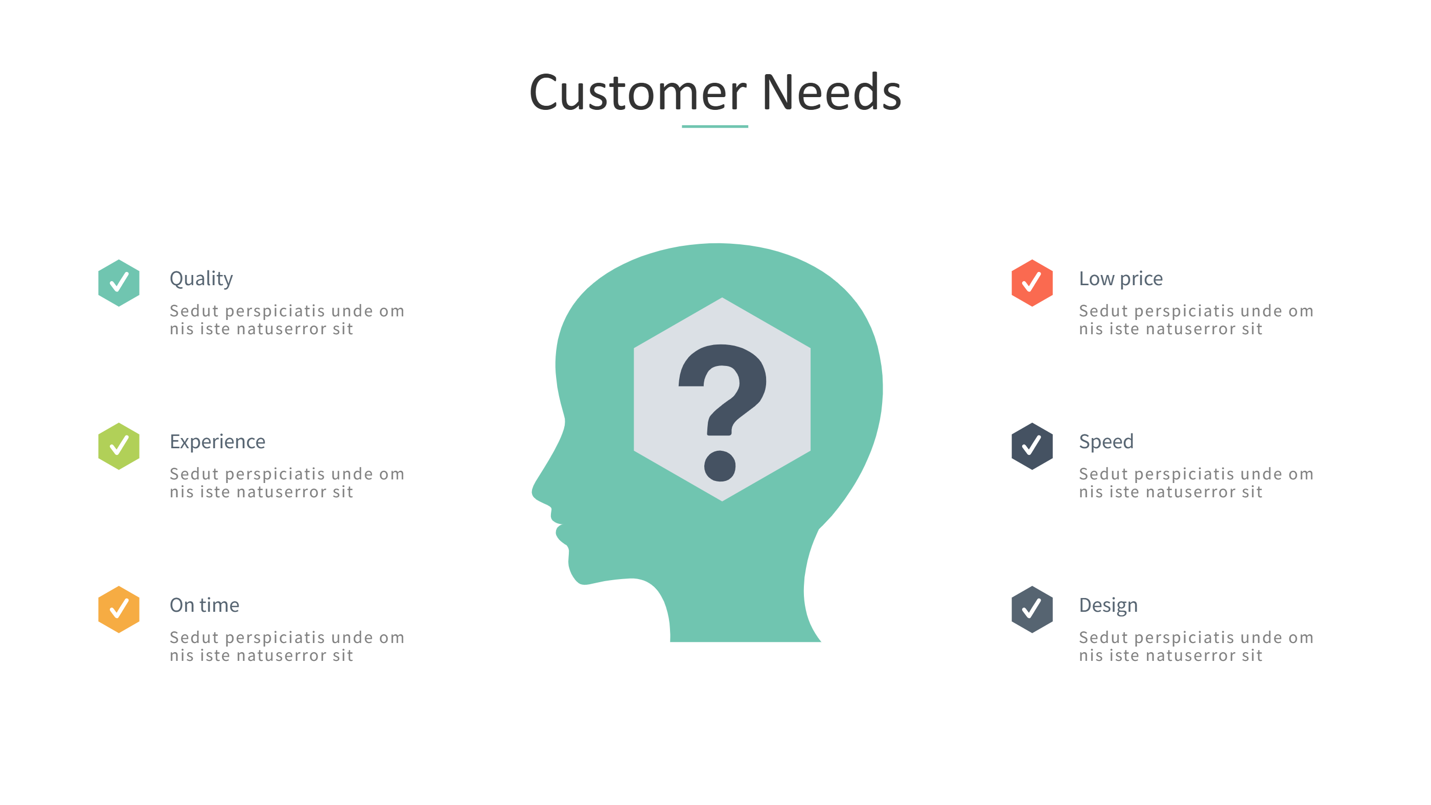
When to Use Shadcn Chart Template Infographic: Use it during MVP planning, pitch decks, onboarding packets, and client previews that need a quick tour of chart options. It helps product teams share a vision for KPI cards, waffle chart grids, and React Native chart kit screens while keeping brand colors aligned with shadcn chart blocks. It also supports engineering handoff because everyone can point to one visual when discussing tooltips, legends, and responsive states.
How to apply the template in the AI generator: Open the AI creation tool on the homepage, pick the chart layout, and paste prompts like React Native chart kit weekly revenue line, shadcn chart donut for churn, and waffle chart for device mix. The AI fills the panels with your labels, legend text, and example values. You can adjust axis names, swap colors, and add icon buttons for filters. The flow is fast: select template, enter prompt, review placements, and save.
Download and edit options: Click download to open the online editor. Save as PPT for workshops, PNG for product docs, or SVG for dev tickets. You can resize panels, switch from light to dark mode, update grid density, and export again. The editor keeps alignment rules so bar, line, and donut charts stay balanced across shadcn and React Native layouts.
FAQ Q: Can I mix shadcn components with React Native chart kit styles? A: Yes, keep one color palette and one font so the mixed charts look like a single system. Q: How do I show interactions? A: Add short callouts near each chart describing tap, hover, or swipe behavior and keep verbs simple. Q: Can I prototype a waffle chart here? A: Replace one panel with a 10 by 10 grid, fill the needed squares, and add a compact legend for categories. Q: How do I handle dark mode? A: Switch the background to a dark tone, use light text, and keep accent colors with enough contrast. Q: Will exports stay sharp for mobile specs? A: PPT, PNG, and SVG exports keep crisp edges and readable labels for spec sheets and tickets.