Finance Market Share Piechart Infographic Template
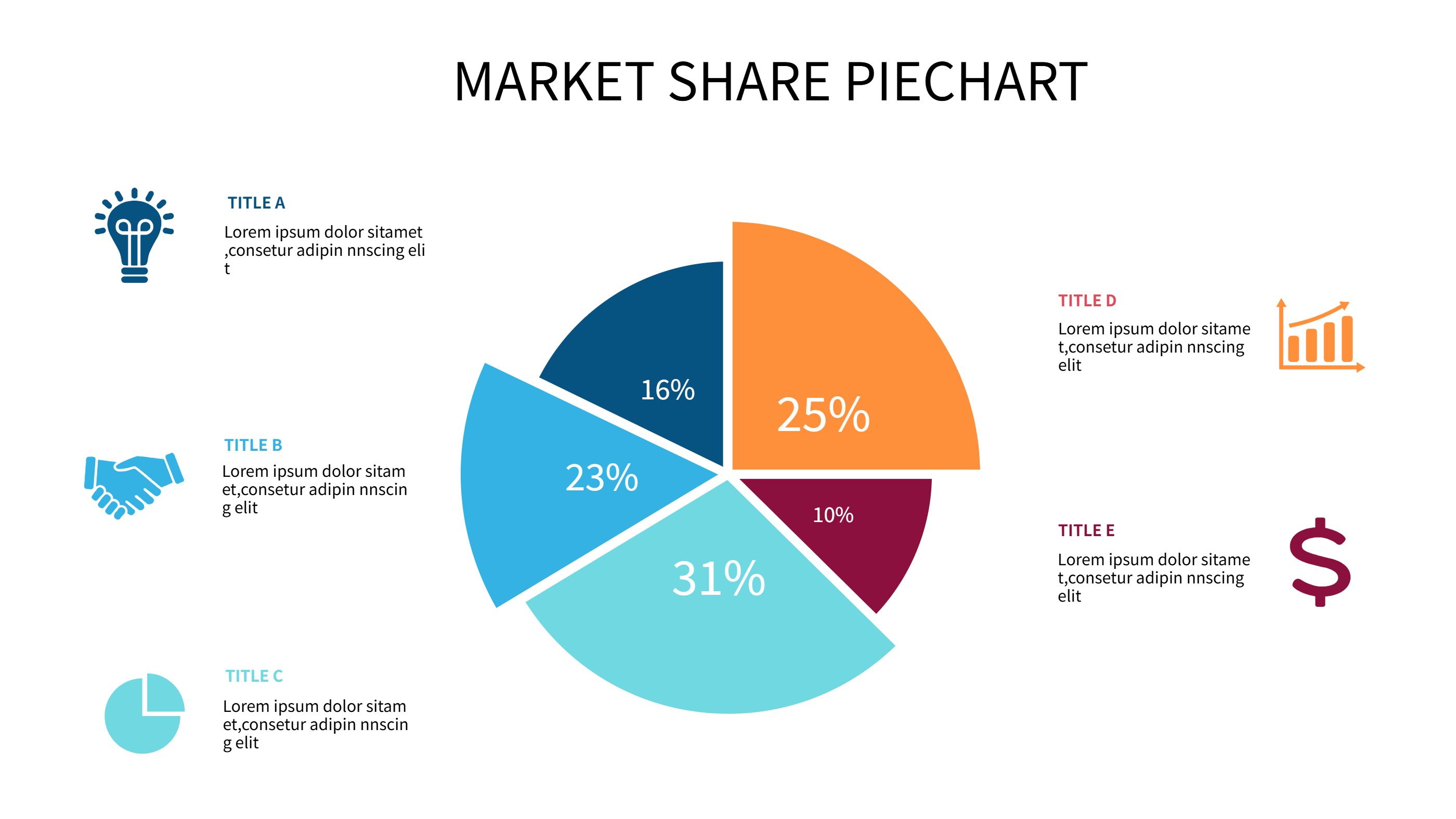
Use this finance infographic template to show market share, revenue streams, and budget splits in one view. The pie chart sits at the center with clear slices in blue, cyan, and orange. Each slice has a short label and a plain note so anyone can read it fast. The style stays friendly for meetings and reports.
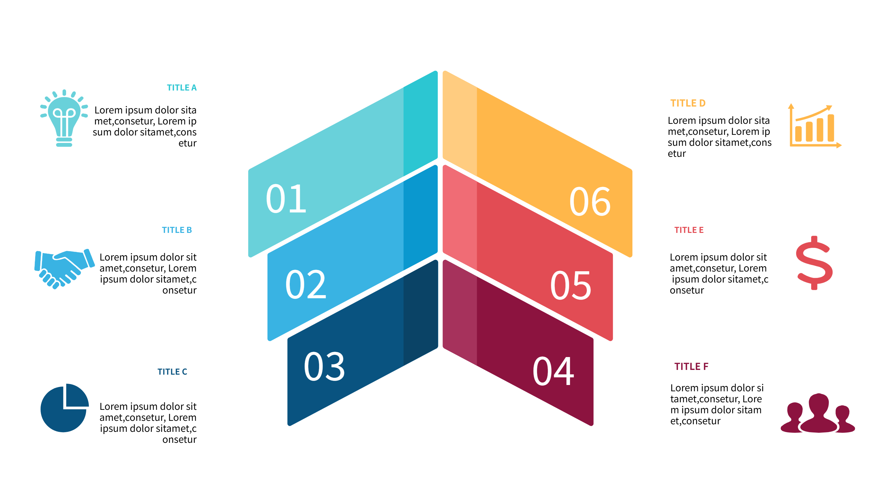
Use it to show how income comes from products, services, or regions. Map cost centers, profit ratios, or savings goals without heavy math terms. You can also track cash flow stages, investment mixes, or fundraising progress. The template keeps space for a summary at the top and small captions on the side, so teams see both numbers and context. If you need to compare quarters, duplicate the chart and place the two images on one slide.
Keep sentences short in the infographic. Use simple words like sales, costs, taxes, and profit. Add icons that match your finance story such as a wallet, coin, or chart. If you present to clients, keep labels under four words and avoid jargon so the finance infographic stays clear on mobile screens. Add a plain note about who checked the numbers to build trust.
To generate it fast, open the AI generation tool on the home page, choose this finance infographic template, enter a prompt with your amounts, labels, and color style, and the tool builds the graphic for you.
Share this pie chart in slides, dashboards, or emails when you need a quick snapshot. Swap the legend colors to match your brand. Duplicate slices if you have more categories. Use the notes to call out risks, budget caps, or savings wins. The calm palette keeps tense money talks easy to follow. Teams that dislike long reports can still grasp the message from this single picture.