History Infographic Multi-Row Timeline Template
What is History Infographic Multi Row Timeline
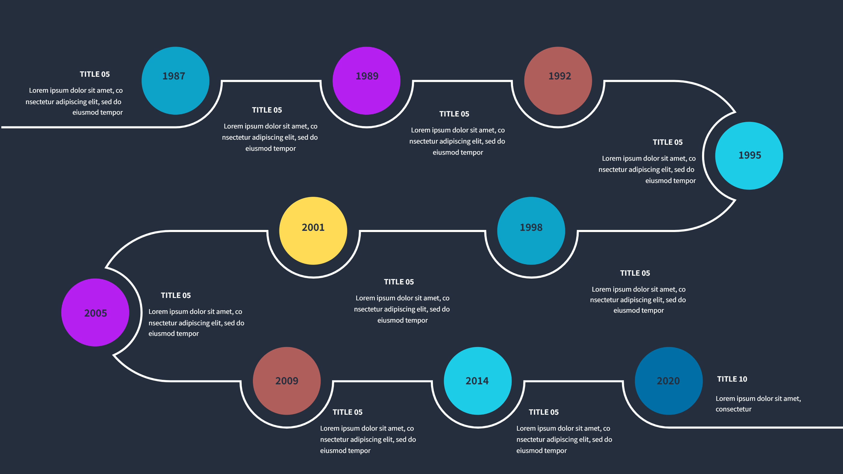
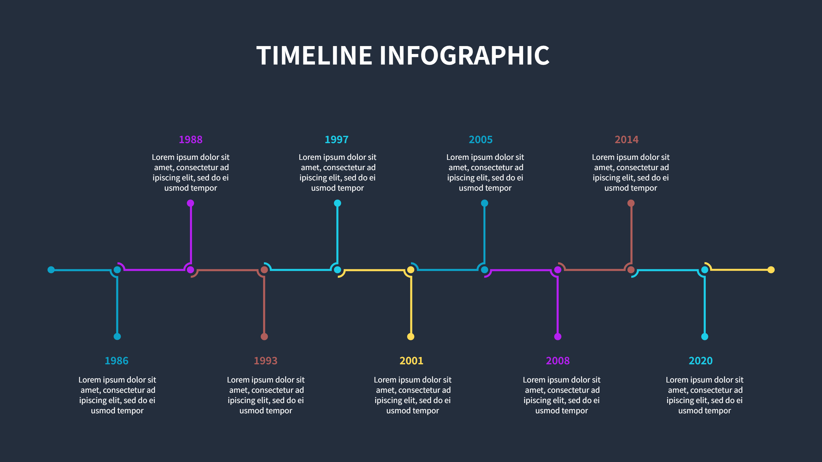
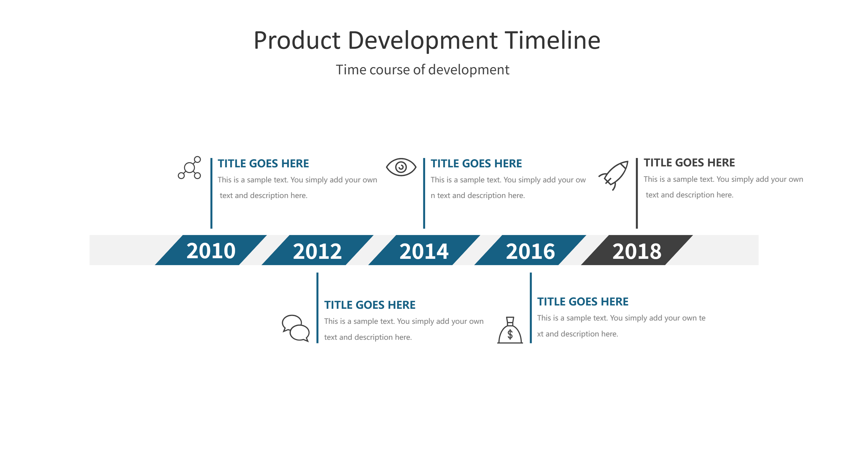
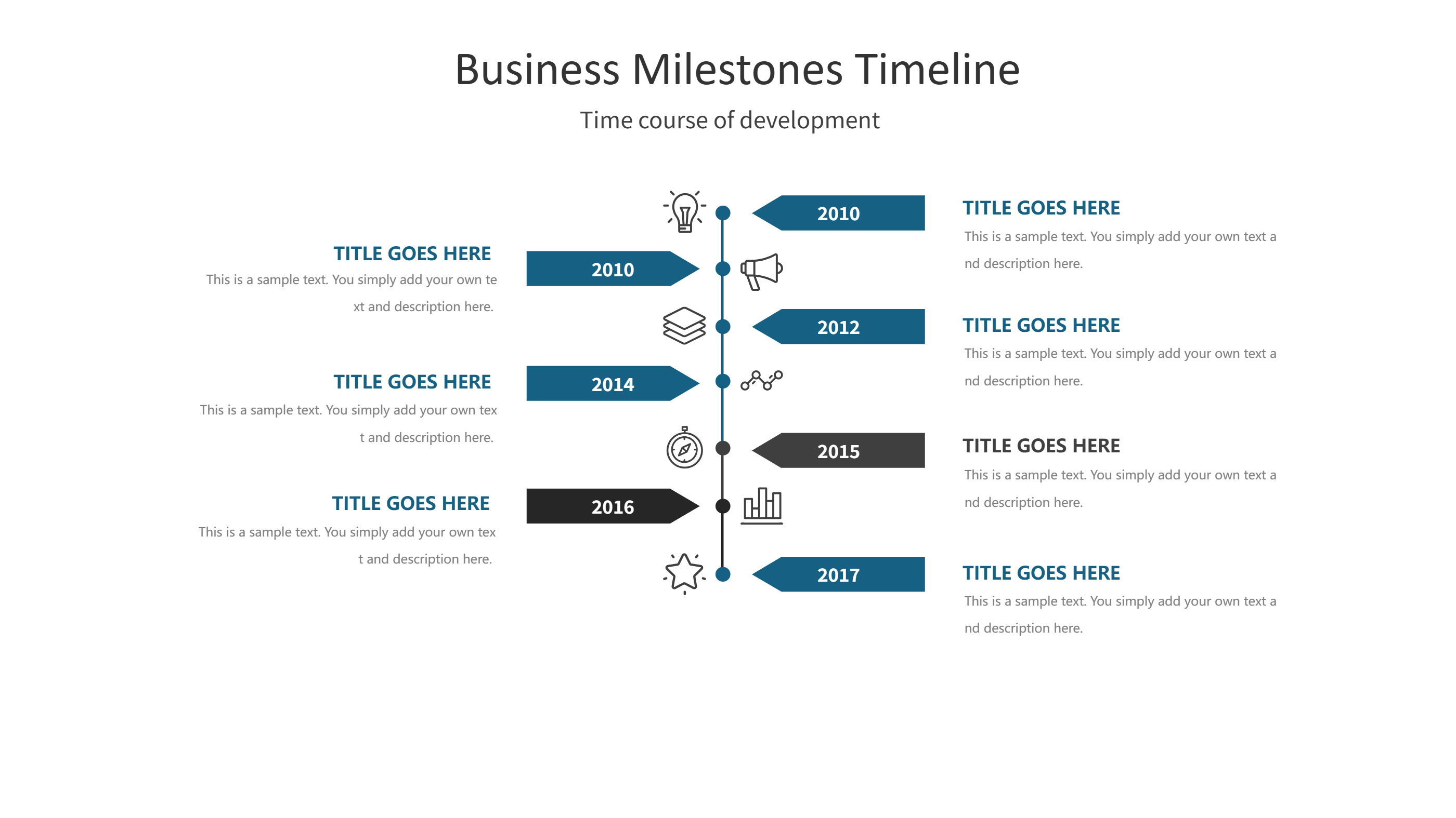
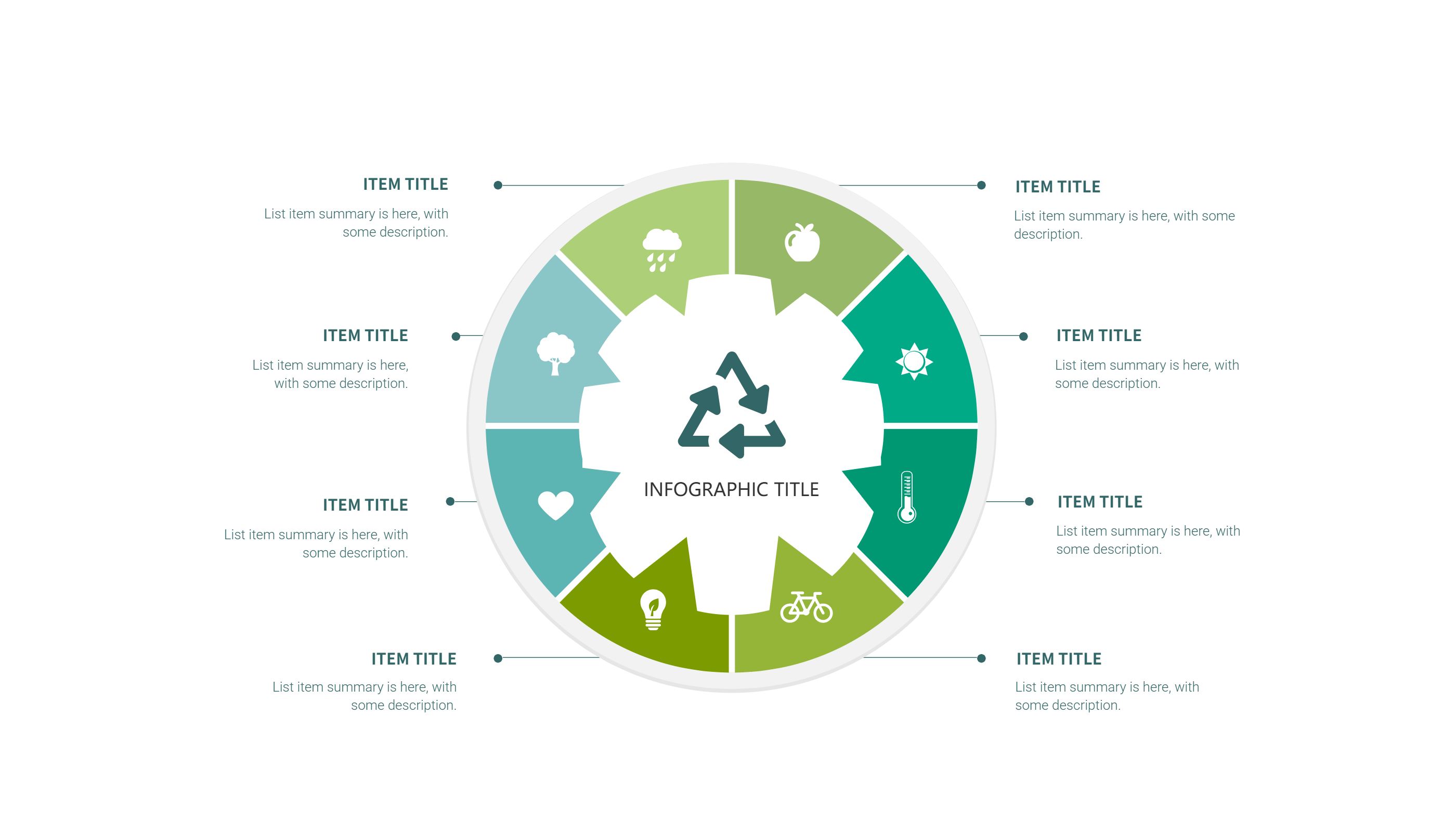
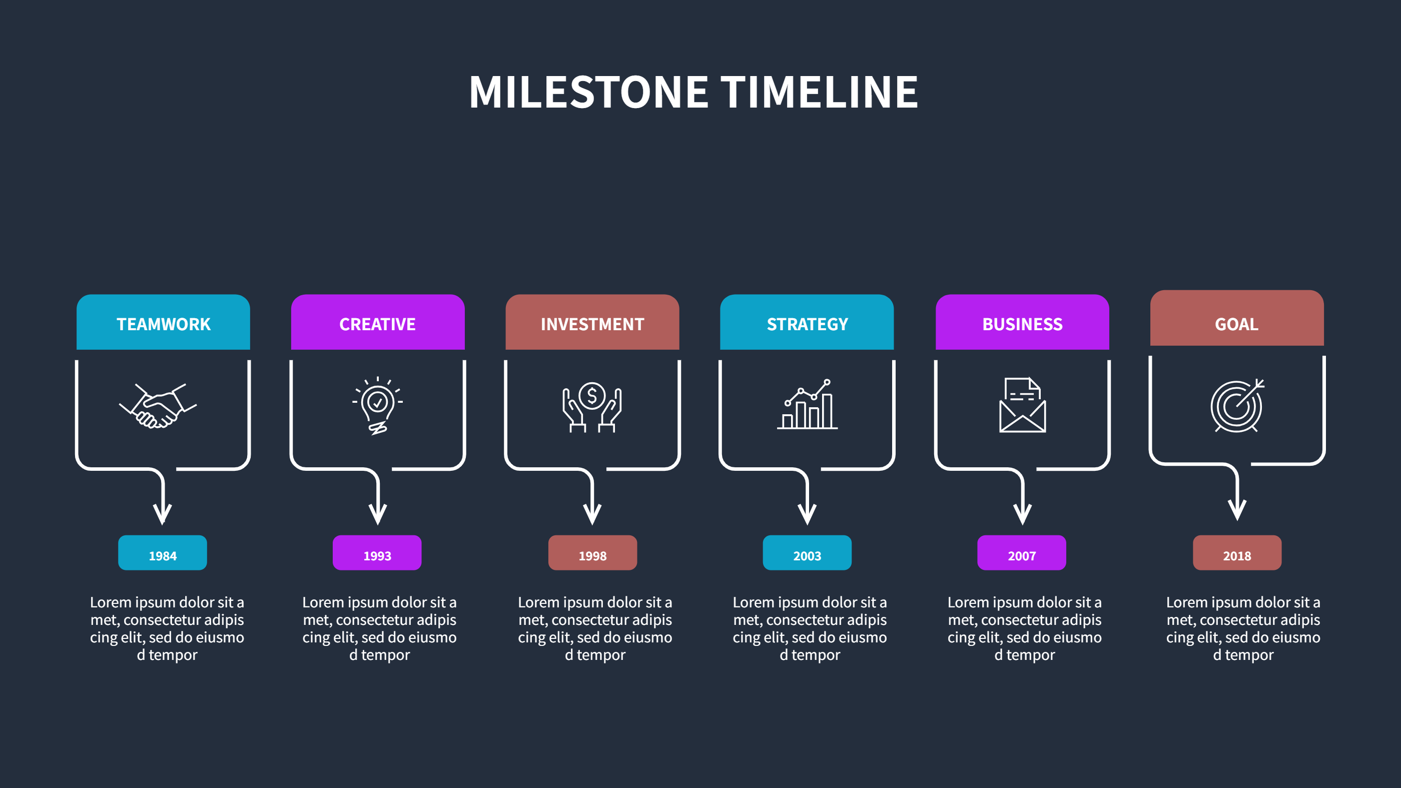
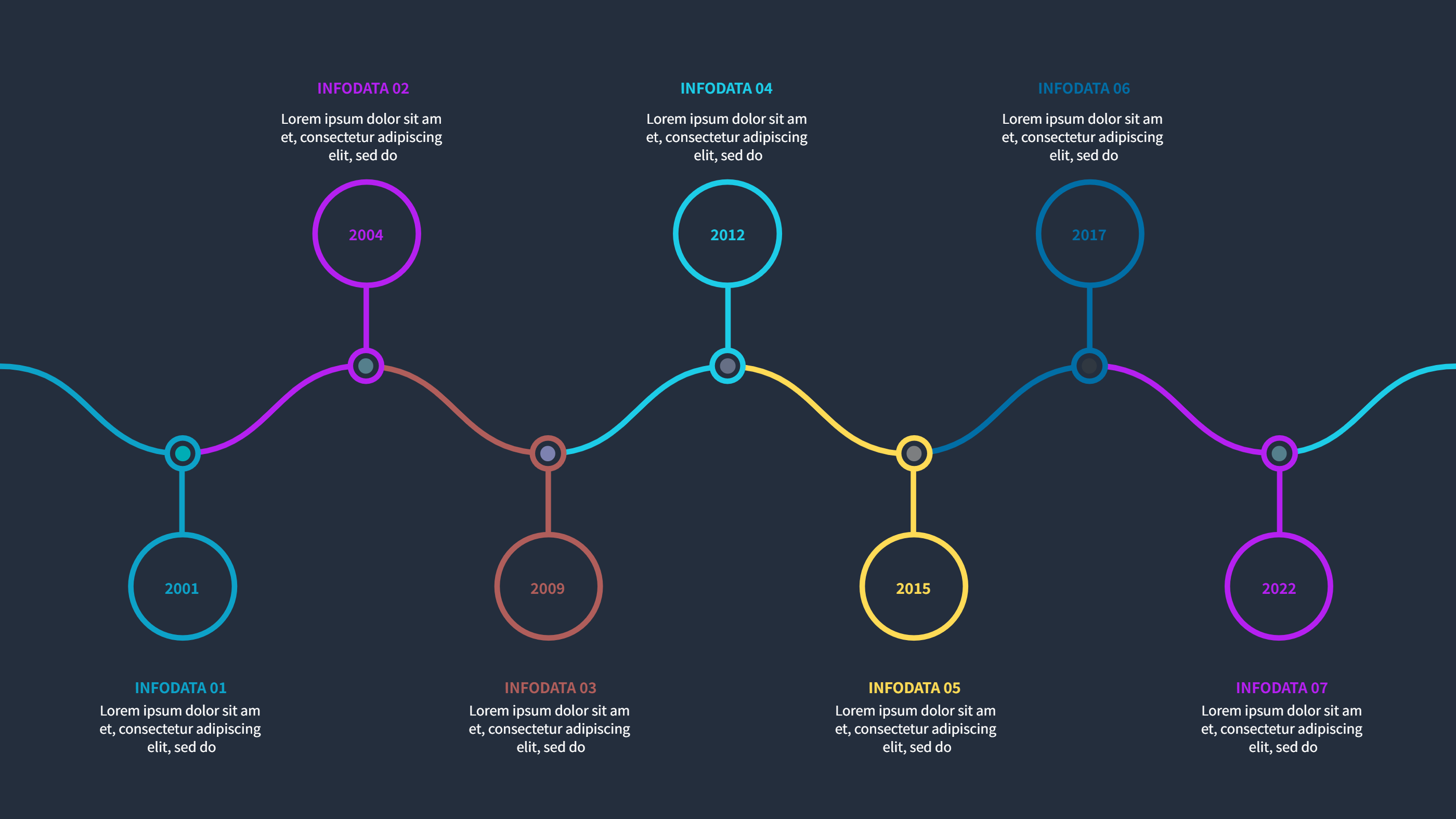
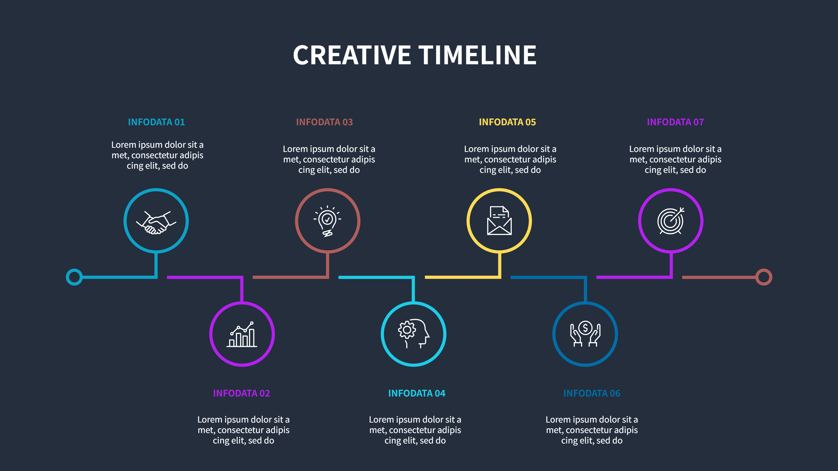
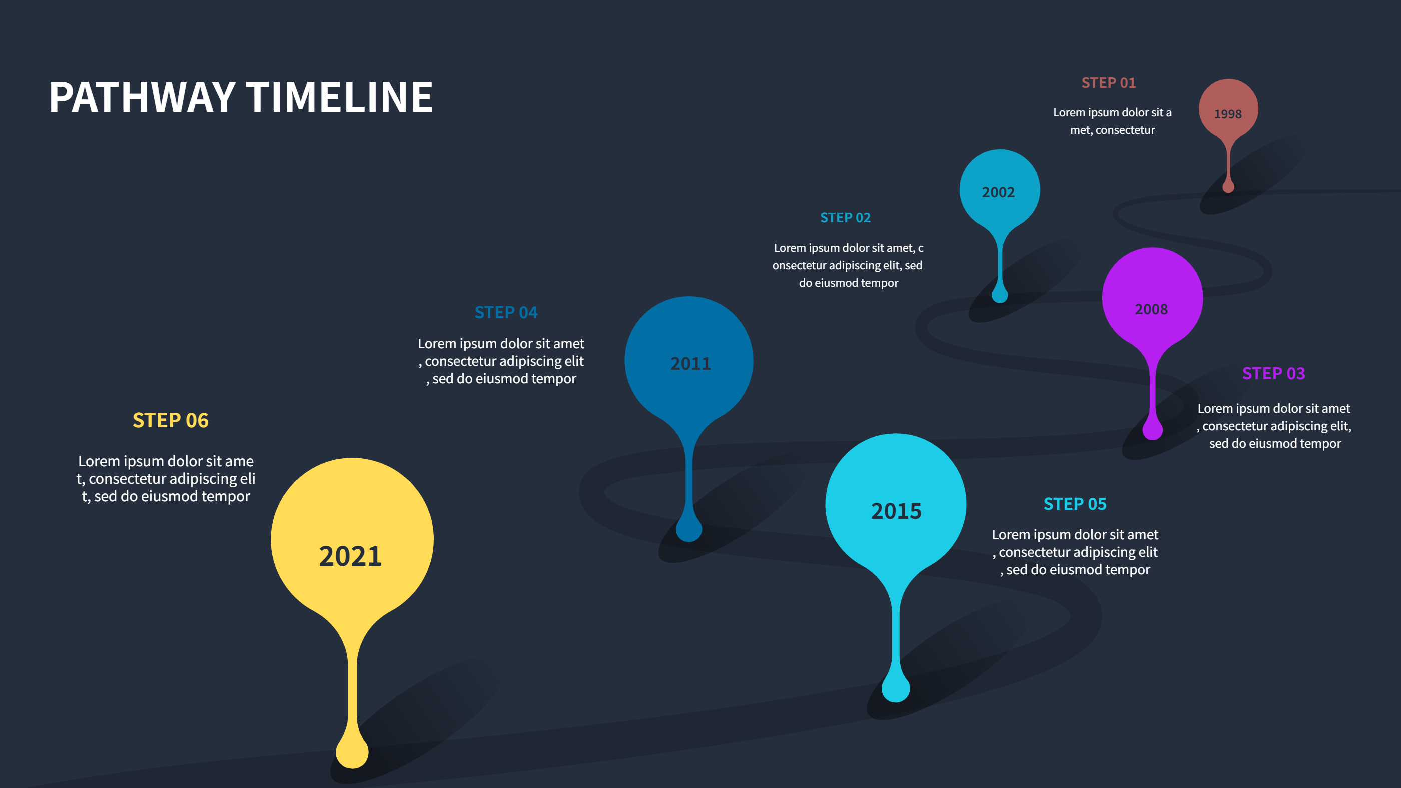
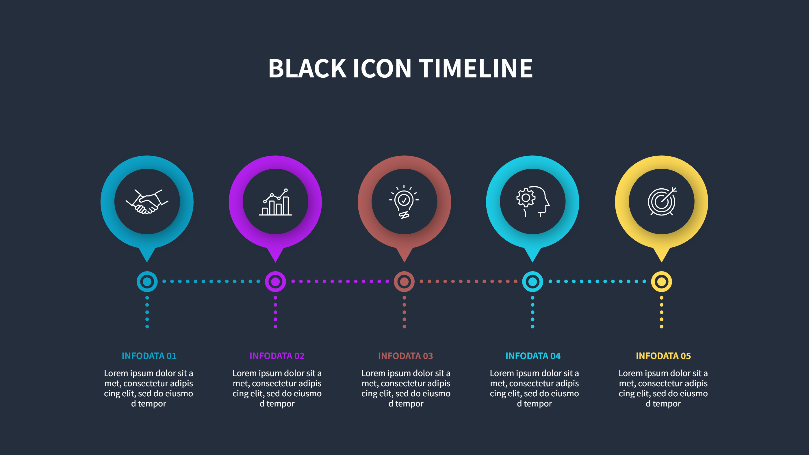
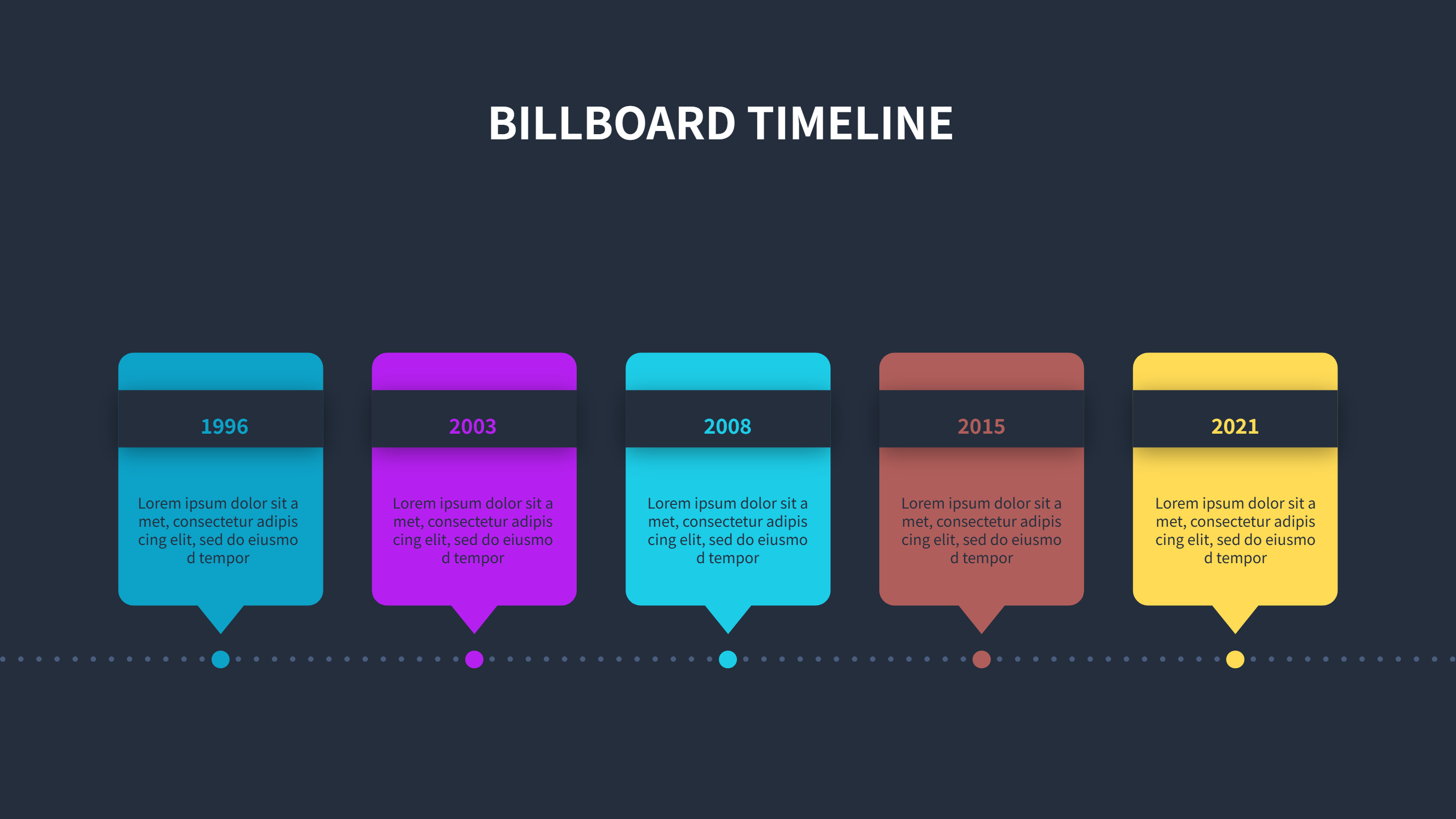
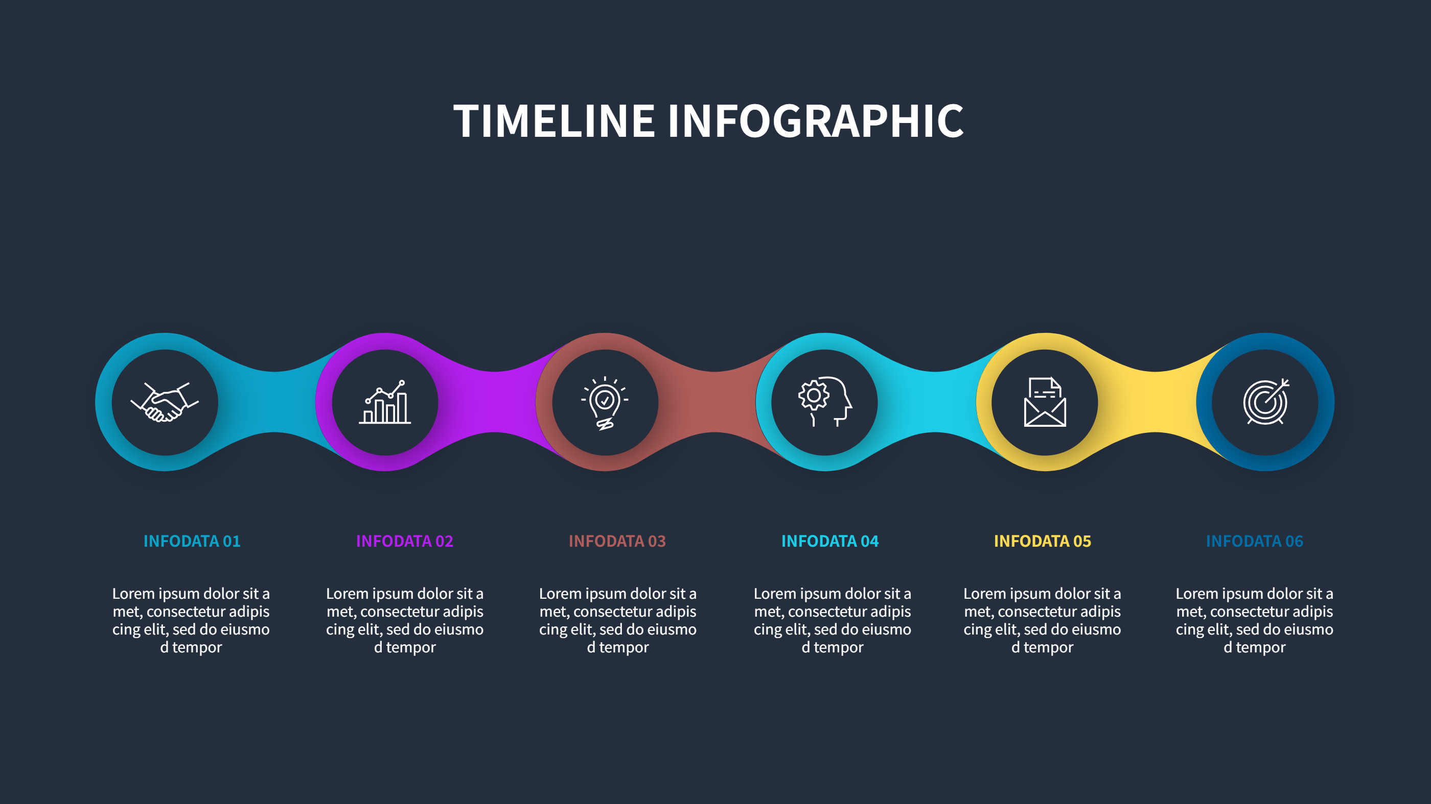
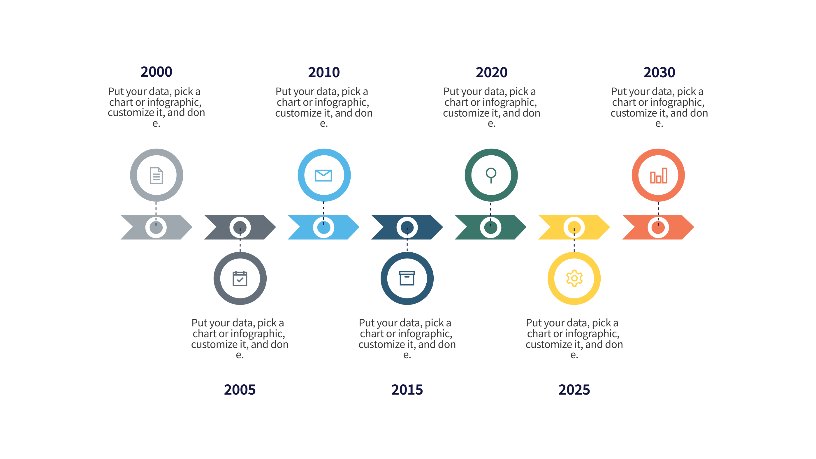
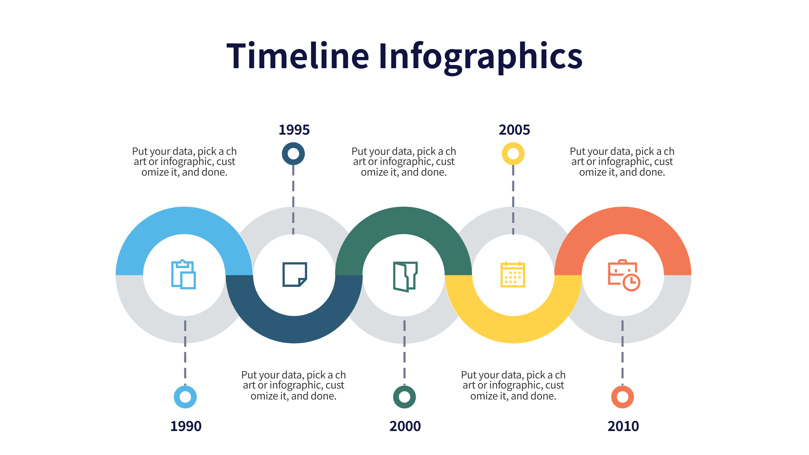
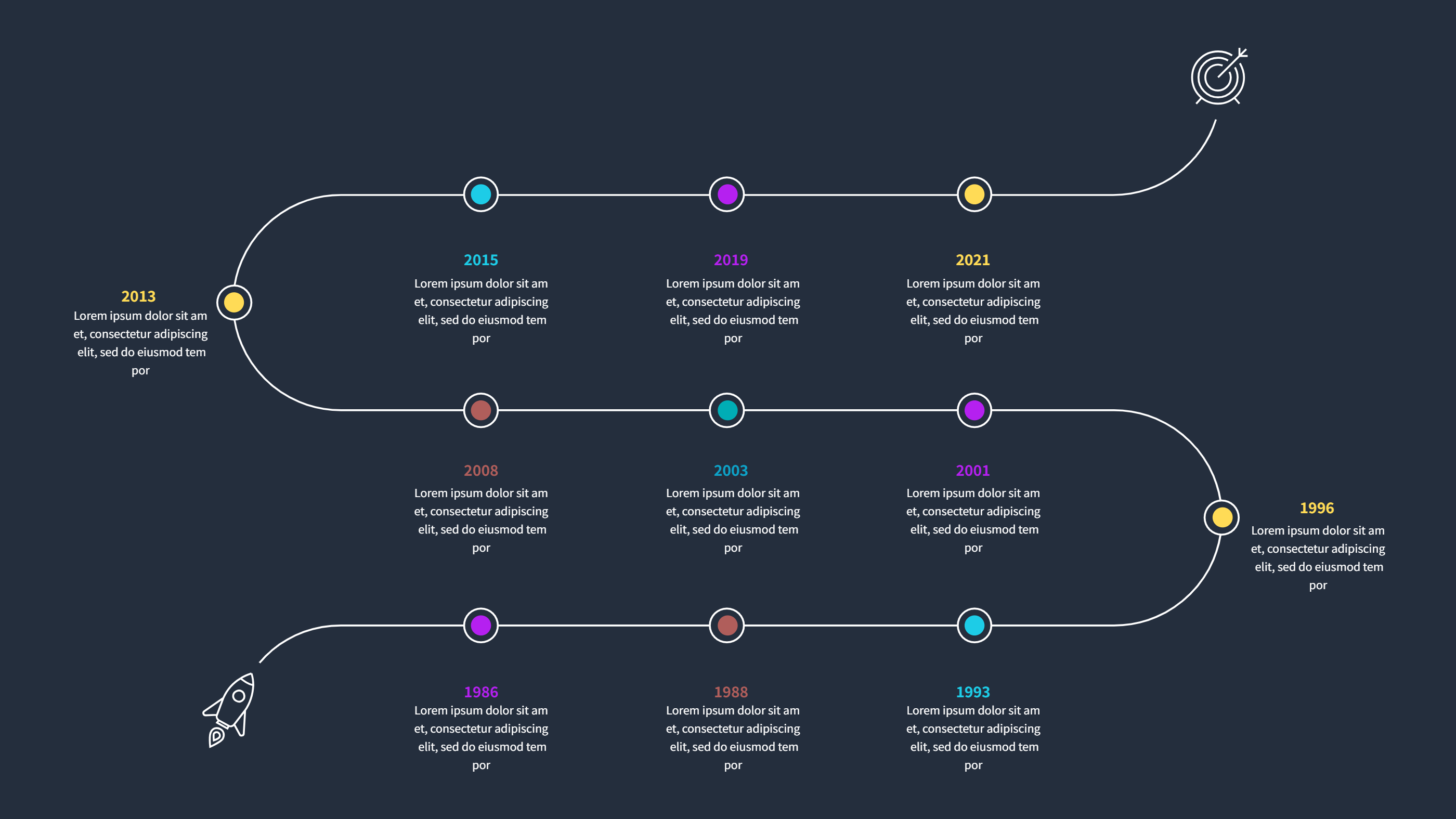
A history infographic multi row timeline shows events in rows that run across the page. Each row can hold one theme, so the story stays clear and easy to follow. You can place dates in order and keep the notes short. The layout feels calm because the events do not crowd one another. It works well for a class topic, a museum display, or a company story. The design is simple, so readers can scan it fast and understand the main idea. This template keeps the focus on the timeline while giving space for brief notes and small icons. It is a clean way to show how a story grows over time.
When to Use History Infographic Multi Row Timeline
Use this history infographic when you want to compare different threads in the same time period. You can separate rows for culture, science, politics, and daily life. It is useful for school projects, study guides, and public talks. It also works for a brand story, a team history, or a project recap. The rows help people see how events connect without mixing them into one long list. The format is easy to print and easy to share on slides. It is a good fit for lessons that need quick context and for stories that need clear order.
How to Use History Infographic Multi Row Timeline Template
On the home page, open the AI generation tool. Choose the history timeline template from the list. Enter a short prompt that names the era, the themes, and the key events you want to show. The tool builds the infographic in the same layout and style. Review each label and keep it short. You can change colors and icons to match your topic. Save the result when it looks right. This gives you a ready slide that you can present or edit.
Download and Edit the Template
Click the download button to open the online editor. Replace the sample text with your own notes. Keep each entry brief so the timeline stays easy to read. Add one short line per event and keep dates clear. You can adjust colors for each row to separate themes. Click the save button when you finish. Choose PPT, PNG, or SVG for the file format you need. Download the file and share it with your class, team, or audience.
Examples of History Infographic AI Prompt Usage
Example 1:
Create a history timeline with four rows for culture, science, politics, and daily life. Use short event notes for each decade of the nineteenth century. Keep the layout clean for a classroom slide.
Example 2:
Make a multi row history timeline for a company story. Show founding, key products, team growth, and customer milestones across separate rows. Use simple labels and light icons.
Example 3:
Design a history timeline for a museum poster about a city. Include events, people, and inventions in different rows. Keep the notes short so visitors can read fast.
Recommended Similar Infographic Templates
Related Template 1: Company Milestones Timeline Infographic Template
Related Template 2: Tech Evolution Journey Timeline Infographic Template
Related Template 3: PowerPoint Vertical Timeline Template
Related Template 4: Timeline Template Aesthetic Business Roadmap
FAQs
Q: Can I add more rows for extra themes?
A: Yes, you can add rows and keep the spacing even for easy reading.
Q: Is this timeline good for school projects?
A: Yes, the layout is clear and works well for class slides and handouts.
Q: Can I change the colors for each row?
A: Yes, you can adjust colors to separate topics and improve clarity.
Q: Can I print the timeline for a poster?
A: Yes, it prints cleanly and stays readable at a larger size.
Q: Can I share the file as PNG or SVG?
A: Yes, you can download PPT, PNG, or SVG from the editor.